Exhibiting Absence and The Trail of Hansel & Gretel

The title of this post references two texts accompanying two recent museum exhibitions on the diorama in relation to contemporary art: ‘Exposer l’Absence’, the curatorial introduction of the extensive catalogue for the exhibition ‘Dioramas’ at Palais De Tokyo in Paris in 2017, and the curatorial text for ‘Smaller Worlds. The Diorama in Contemporary Art’ in the Ludwig Museum in Budapest, on view between October 2022 and February 2023, which included one of my works, ‘The White Hide [v]’. 

Between June 14 and September 10, 2017, the exhibition ‘Dioramas’ was on view at Palais De Tokyo. This co-production with the Schirn Kunsthalle in Frankfurt shone a light on the particular position of the diorama in art history: “Dioramas goes beyond the historical narrative of the diorama and its influence on major artists of the 20th and 21st centuries. Inviting the audience to step into the hidden mechanisms of a diorama, the exhibition dismantles its strategies of illusionism and allows the viewer to build a critical approach on the power of representation.”1

At the time, I was preparing a solo exhibition at the now discontinued gallery LhGWR in The Hague (The Netherlands), and working on a digital animation loop, ‘The_Archive’. While producing this film, I didn’t realise yet the work was closely related to dioramas, and I failed to see a connection to the Paris exhibition. I didn’t visit ‘Dioramas’, but once I recognized much of my body of work is, in fact, ‘dioramic’, and that the diorama in relation to my digital practice was in need of further investigation – through this doctoral artistic trajectory – I ordered the accompanying publication. 

The catalogue not only gives an overview of the works in the exhibition, but also contains a wealth of essays on the subject from historical, conceptual, artistic, and anthropological points of view by the likes of art historian Aleth Mandula, media historian Erkki Huhtamo, historian of science Karen Wonders, philosopher of science Donna Haraway and artist Hiroshi Sugimoto. 

The introduction, written by curators Claire Garnier, Laurent Le Bon and Florence Ostende of Palais De Tokyo, and Katharina Dohm of Schirn Kunsthalle, articulates the ambiguity of the diorama wonderfully. It bridges contemporary art – the domain I, as an artist, am part of and participating in – and research on the diorama as a scientific and illusionary manifestation.

Smaller Worlds. Dioramas and Contemporary Art’ was conceived by curator and art historian Zsuzska Pétro for the Ludwig Museum of Budapest in Hungary. Pétro departed from an ongoing personal fascination with dioramas. The exhibition was postponed for more than a year due to pandemic restrictions across Europe, and eventually produced by Pétro – from a distance, in Berlin – and curator Jan Elantkowski in the short time-span of six months and in challenging circumstances, forcing the museum to opt for a digital catalogue instead of a printed one.

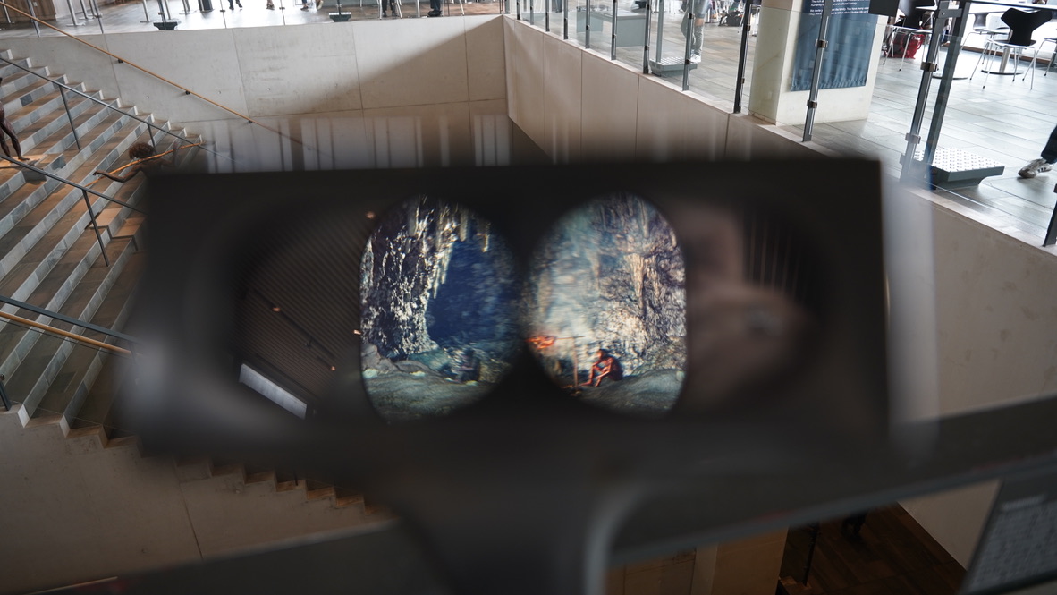
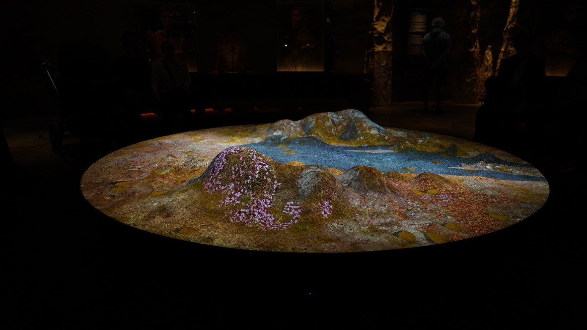
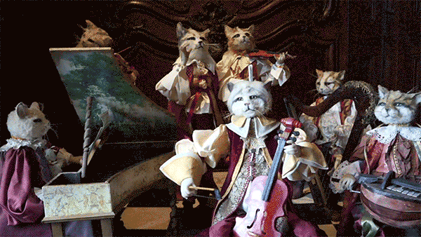
As the title suggests, in ‘Smaller Worlds’ the miniature was prominently featured in lightboxes, installations and sculpture, next to video and animation (by Nathalie Djurberg and Hans Berg, and myself) and works that use Virtual Reality. The exhibition as a whole took place on the museum’s first floor, with atmospheric lighting adding to a sense that the whole floor was a large, dioramic peepbox

In his opening speech, film director, poet, and cultural attaché of the Hungarian Embassy in Germany, Can Togay dives into the magical effect dioramic scenes often have on the spectator.2 In psychology, ‘affect’ is the emotional response to an experience, literally meaning feeling. In the diorama-experience, Togay emphasizes the ‘sense of wonder’ which also emerges in the eye-witness account of Daguerre’s London diorama by J. Saunders.

There seems to be no better way to survey the multitude of views on the diorama than by means of an extensively supplemented summary of the texts that accompanied both exhibitions, ‘Dioramas: Exposer l’Absence?’ from the Palais De Tokyo exhibition, and the curatorial text by Pétro and Elantkowski and the opening speech of Togay for ‘Smaller Worlds’ in Museum Ludwig.3

Architecture as technology

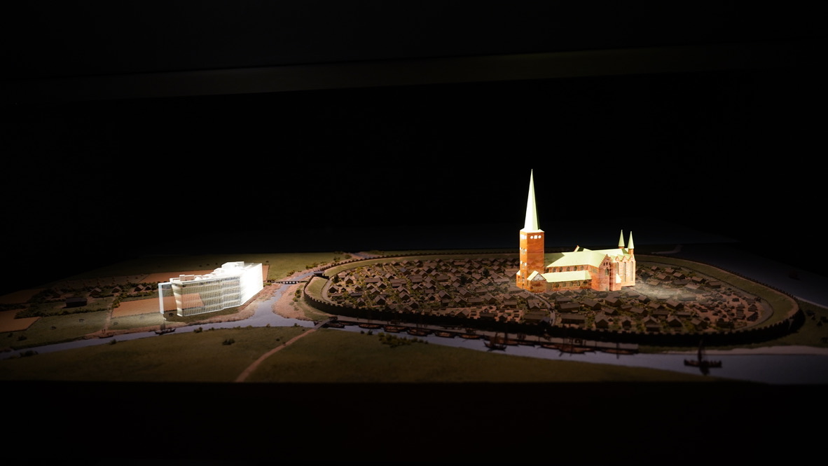
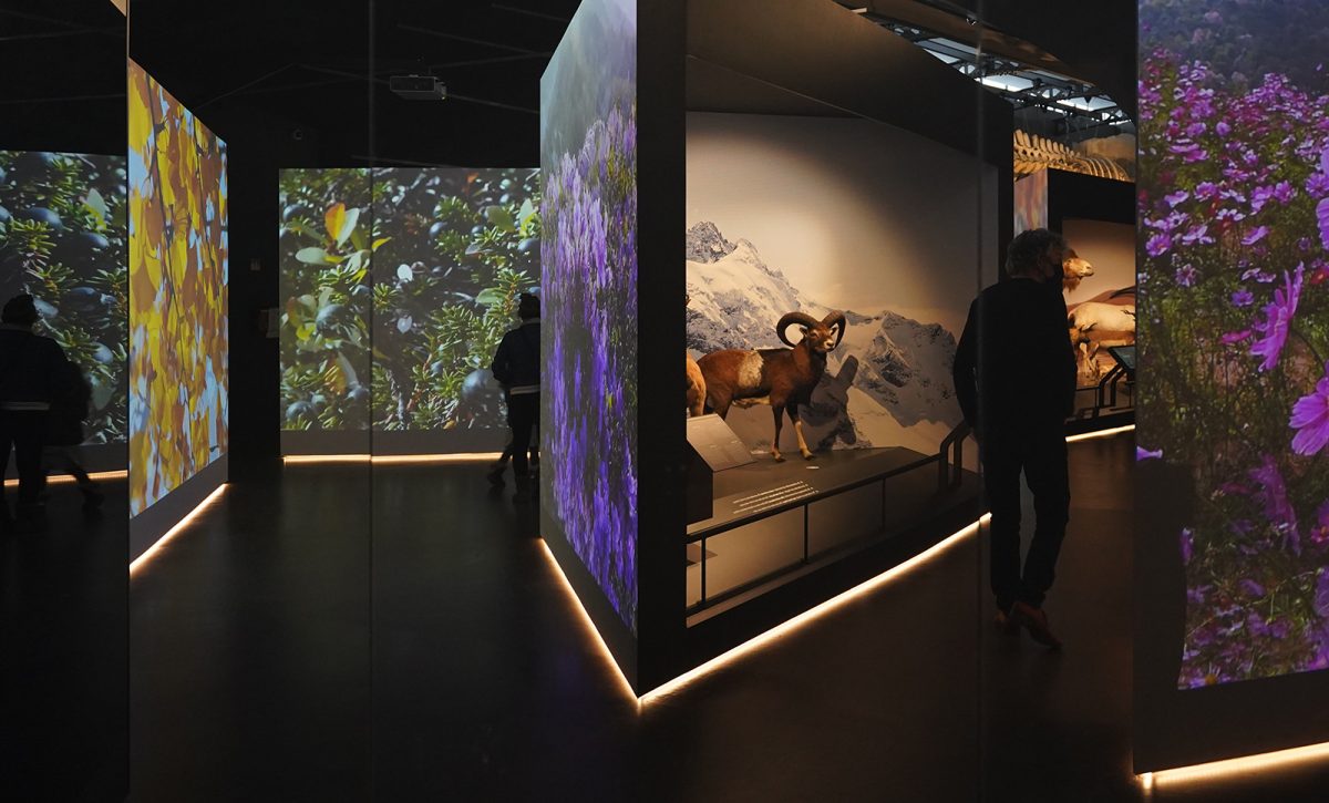
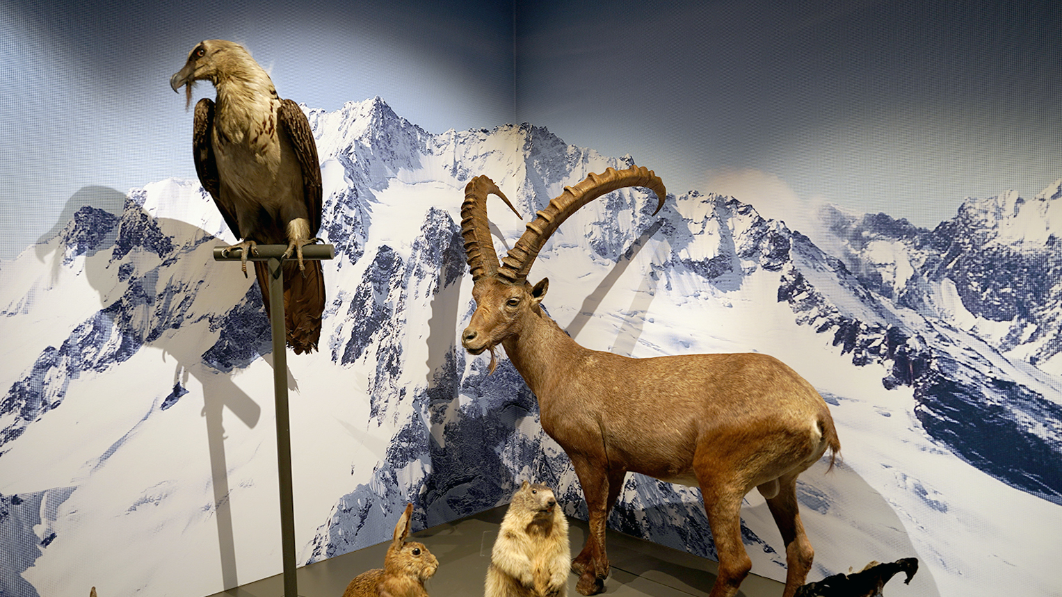
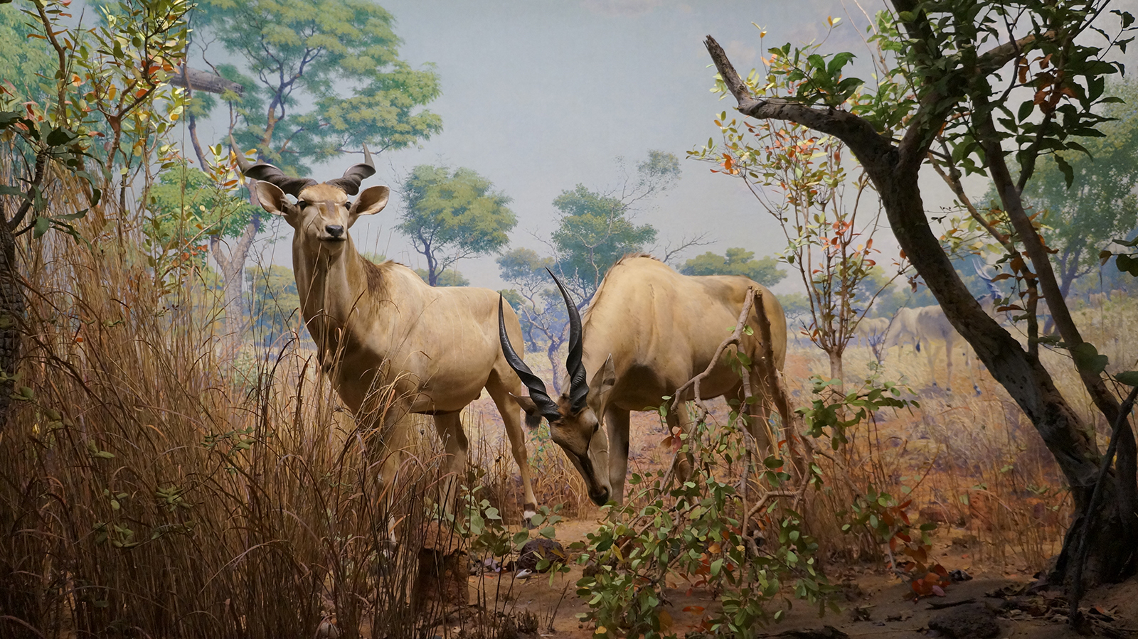
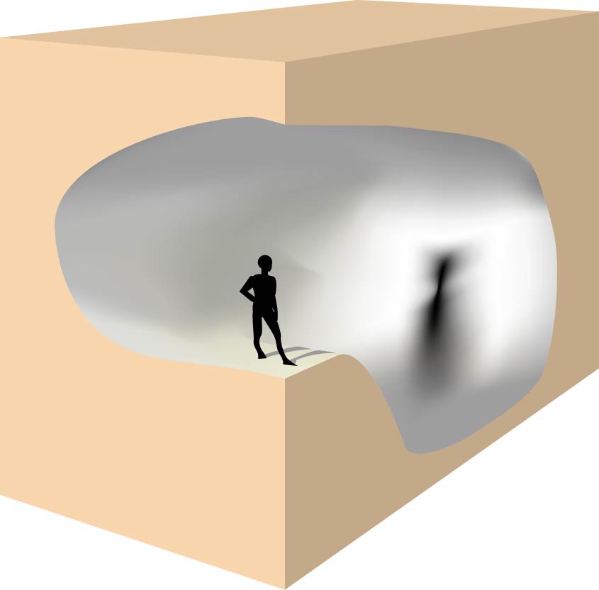
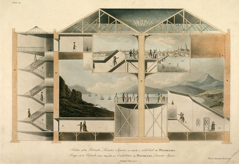
One of the difficulties of describing the diorama, whether it’s Daguerre’s ‘moving painting’ or the habitat dioramas in museums for natural history across the world, is its interrelation to architecture. A diorama is not just the visible scene, but extends to the space that surrounds the depicted ‘view’. Daguerre’s ‘moving paintings show’ needed a specially designed building containing rotating tribunes, and pulleys and levers. The advanced life-sized ‘view boxes’ of natural history museums function best when architectural conditions, such as curved walls and glass panels, are applied.

This relates to what media historian, urban historian and cultural critic Norman M. Klein calls ‘scripted spaces’ in his elaborate – and at times, in the spirit of the subject, purposely disorienting – survey on visual illusions ‘The Vatican to Vegas. A history of Special Effects’ (The New Press, 2004). Klein deconstructs the architecture of Baroque altars, shopping malls, theme parks and museums, but also cinema, sculptures, and paintings by exposing the mechanisms behind the ‘illusion’ in the function of storytelling.

Like Donna Haraway, who considers the museum as “a visual technology”4 and Karen Wonders5, whose elaborate studies on dioramas discuss in detail the many models and technical plans that were part of building a diorama, Klein frequently connects technology to these scripted spaces, for instance when he writes: “And like our disaster movies, Baroque effects relied on “software” of a kind: solid geometry for architecture, optics, sculpture, paint, theater. Numerous handbooks after 1550 detailed how to build these illusions, including charts for carpenters, and texts by leading architects like Serlio, the painter Fra Andrea Porzzo, designers like Joseph Furttenbach the Elder.”6

Returning to ‘Diorama: Exposer l’Absence’, the authors found that even though the diorama is much used as an inspiration for contemporary artists, it is largely absent from art history. The essay gives three reasons that may have contributed to this omission: the rise of modernism, scientific ‘inaccuracy’ and colonialist connotations. 

Modernism: the White Cube

As the diorama was conceived in its multiple forms in the 19th century, 20th century modernism regards ‘illusionism’ as contrary to the essence, the ‘purity’ of art. While visual illusions in the 19th century became increasingly sophisticated and mobile – adding, for instance photography, trick-photography, and stereoscopic images with their specially designed viewers – modernism as a counter-movement rejected the illusionary experience of the pictorial. 

Over the course of the 18th and 19th centuries ornamentation lost its symbolic meaning: historical styles were recycled endlessly in neoclassicism, resulting in a mish-mash of revivals with many mass produced objects now labeled as ‘kitsch’ because of their eclectic appearance combining elements from the Gothic, Baroque, and Rococo eras with oriëntalism and exotism, driven by colonialism and upcoming consumerism. 

Ornamentation became associated with distraction, a symbol for the faux, fake: the unreal. The functionality of modernism allowed for a return to ‘the real’. In the visual arts it meant a radical departure of the pictorial in favour of the abstract, and the replacement of eclecticism with minimalism. 

Museums underwent a similar reconfiguration. Donna Haraway describes the American Museum of Natural History, which opened in 1871: “The building itself presents many visible faces. It is at once a Greek temple, a bank, a scientific research institution, a popular museum, a neoclassical theatre. (…) It is impossible not to feel entering this building that a drama will be enacted inside.”7

Throughout the 20th century, ‘the white cube’ became art’s architecture: a presumed ‘neutral’ space, meant to give room to the individual artwork as opposed to the crowded salons of before, walls covered in various colours and wallpapers, the art floor-to-ceiling presented in shiny, golden frames or on elaborately decorated marble columns. In that context, it’s easy to imagine the diorama as a relic from a dusty, overcrowded, and soot-covered era, at odds with the bright ‘freshness’ of contemporary exhibition design. 

Modern – and modernist – museums, however, are subject to their own illusionary mechanisms.

Note: this needs some elaboration.

Virtual architecture: looking both at and through the screen

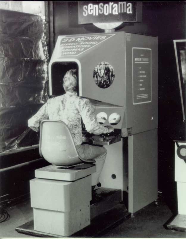
A way to work around the imposing white cube is the ‘black box’, which will take us from cinema to the presentation of video art, one of the domains my work is taking place in through means of digital animation. In addition to physical exhibition locations, the screen – through the internet – has become a new kind of ‘stage’ for the presentation of (digital) art expressions, even more so since the Covid-19 pandemic restrictions between 2020 and 2022 saw exhibition spaces closed. 

The glass covering the computer– and mobile device screens facilitates, in some ways, a new diorama-like experience, especially when it comes to relatively recent applications such as Virtual Reality (VR) and in particular Augmented Reality (AR). Whereas VR provides immersion in an entirely digital environment that requires a helmet disconnecting the senses from the physical world, AR gives the illusion of ‘looking through’ the mobile device screen, overlaying reality with an additional digital layer. This can simply be information, but also digital sculptures that the spectator can walk around or through. 

The similarities between digital representations and dioramas has set a reappreciation in motion. We’ll return to this synchronisation of emerging ‘illusionary’ technology and contemporary art through artists such as Eva l’Hoest (‘Under Automata’, 2016), Kelly Richardson (‘Talisman II’, 2021), Auriea Harvey (Minoriea, 2021), and myself (focusing on a series of works pertaining to ‘The Plot’, 2019-2023).

Scientific objections: the Chambers of Horrors

Science came to reject the ‘imprecision’ of the depicted combined species in a natural history setting: the diorama is often perceived to prefer theatre over science, clouding the objectivity of scientific research. 

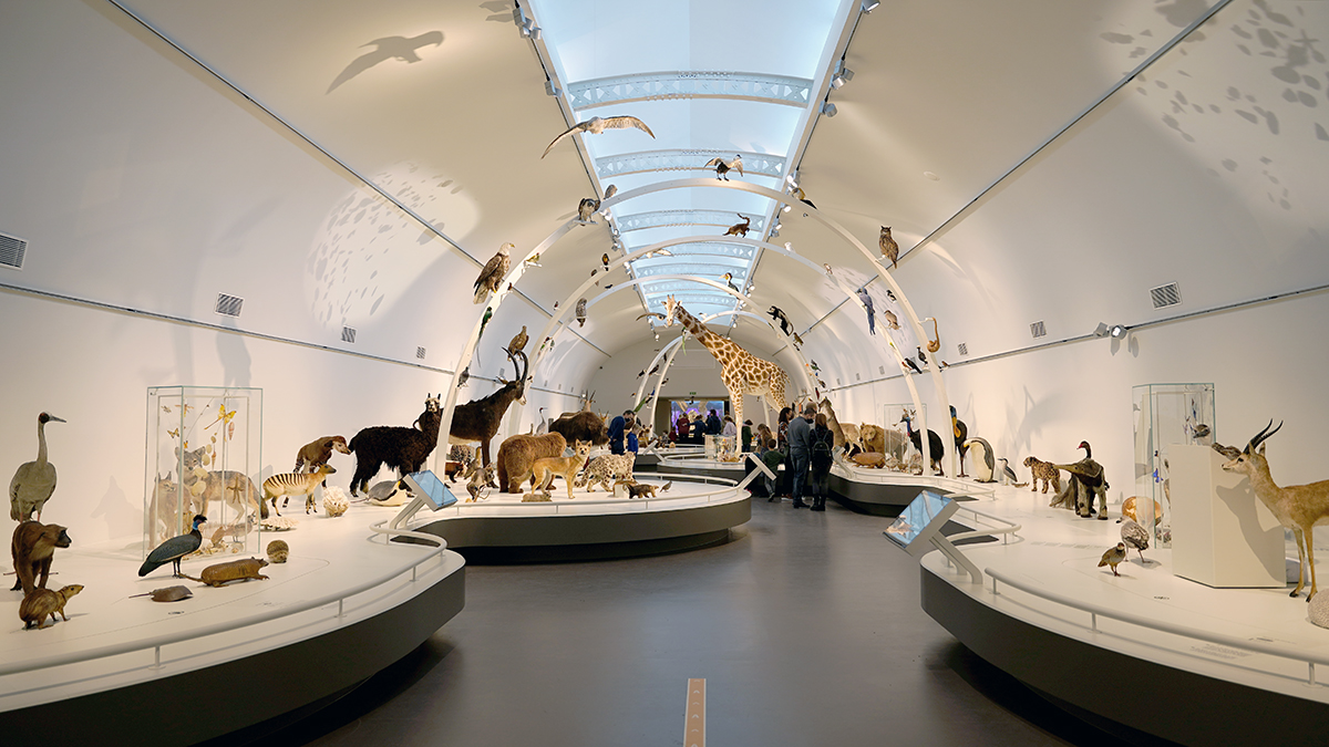
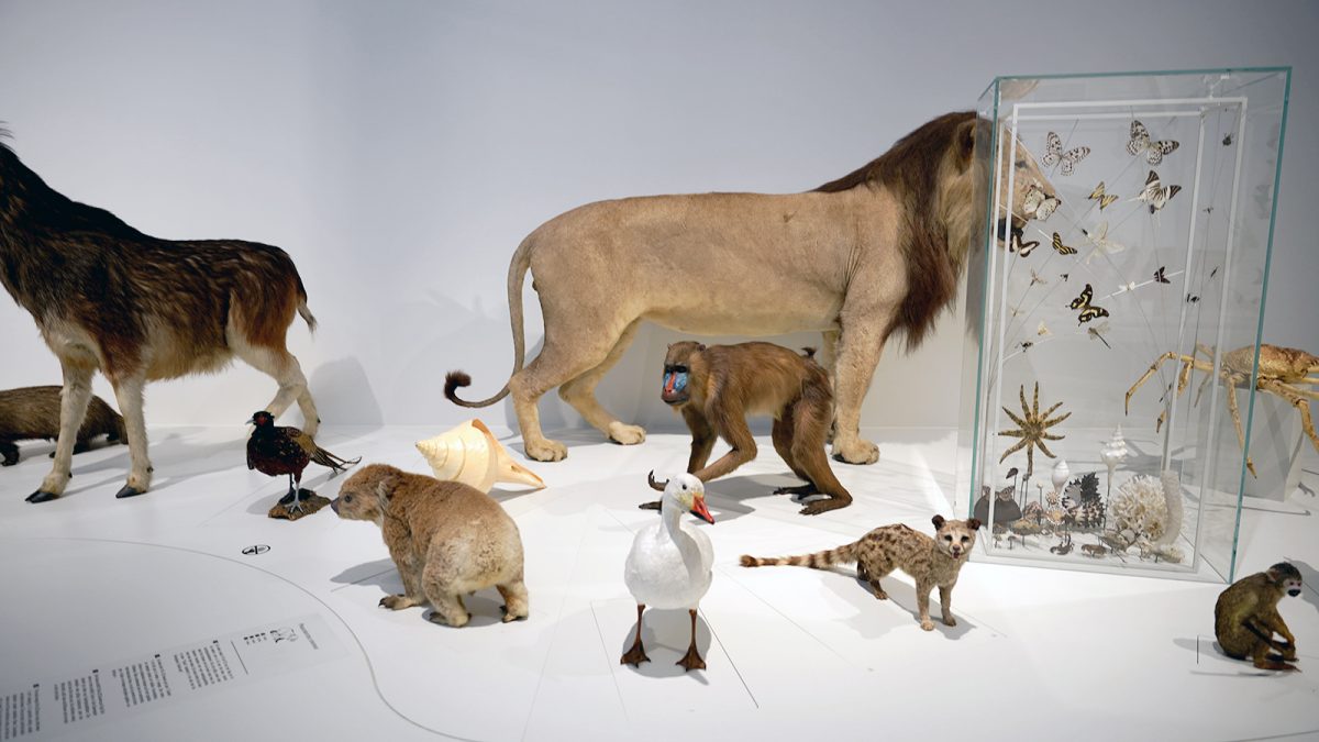
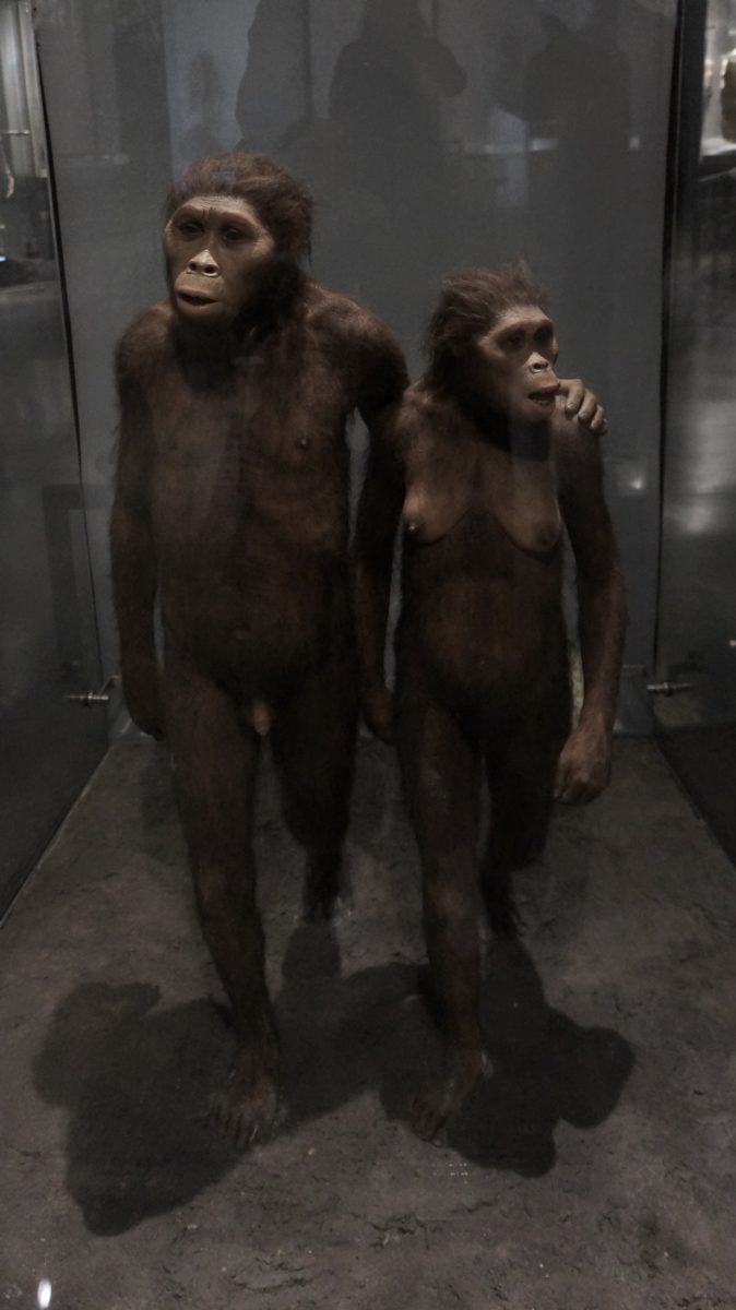
In the chapter ‘Science, Art, and Authenticity in Natural History Displays’ by Lynn K. Nyhart, professor of the history of science at the University of Wisconsin-Madison, as part of the aforementioned ‘Models. The Third Dimension of Science’, three variations of natural history displays are mentioned: mounted animals, habitat groups, and the diorama. The difference between habitat groups and dioramas can roughly be found in the lack of a background painting. Habitat groups are assemblies of mounted animals that are contextually related and often placed in a fragment of simulated landscape. The groups resemble elaborate sculptures that one can study from all angles, rather than the framed, transportive illusion of the diorama. 

Nyhart writes: “These naturalistic representations are unlike most other models in science. Models of planetary motion, atomic structure, or DNA, for example, aim to render visible that which we cannot see; a natural history display usually depicts something we already recognize as an animal, a plant, or a section of a landscape. Nor do natural history groups displays resemble physical embodiments of abstract ideas or theories, such as models of mathematics or economies.”8

Science made accessible

Here perhaps, Linnaean taxonomy needs to be mentioned briefly, as it is this classification ‘model’ the habitat diorama attempts to escape. In 1735, botanist, zoologist and physist Carl Linnaeus published ‘Systema Naturae’, in which he proposed a hierarchical structuring of three kingdoms, the Animal, Vegetable, and Mineral, that in turn were divided in classes, orders, genera, and species.The foundations of this ‘binomial nomenclature’ are still in use, though many changes and additions have occurred throughout time – for instance, a species that, based on its appearance, was first thought to be part of one genera, turned out to be home at another on a genetical level. ((Unfortunately, Linnaeus’ increased his categorization for humans over the course of the Systema Naturae editions, which laid out erroneous groundwork for scientific racism.))

Linnaean taxonomy lies at the base of many natural history displays, comprehensively showing variations and relations amongst species. At the same time, this orderly presentation of specimens – in isolation, mounted in glass cases – poses its own limitations, to which the habitat group and the habitat diorama provide a solution.  

Nyhart describes the tension between the scientific representation through Linnaean taxonomy and habitat dioramas as part of a major shift taking place in the early 20th century when museums transformed from scientific research institutions to pass-throughs for knowledge to wider audiences: science made accessible. 

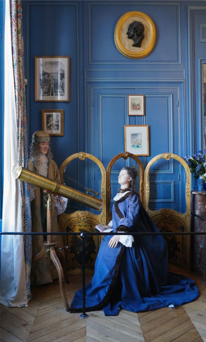
She highlights a dispute from the first decade of the 20th century about the display of a habitat group between two German museum directors: Otto Lehman of the Aitonean Museum (near Hamburg) – an admirer of the diorama – and Benno Wandolleck of the Zoologischer Museum in Berlin and later the Ethnographic Museum of Dresden, who compared the display to the ‘panopticon’. Here, I have to note that Nyhart translates the German ‘panoptikum’ – which are waxwork displays such as the popular Madame Tussauds franchise –  to the English ‘panopticon’ – which is a term used for a type of prison design aimed at the optimal surveillance of the prisoners. In this context, though, Nyhart’s ‘panopticons’ of course are the waxwork displays.

Whereas Madame Tussauds – founded by wax modeler Marie Tussaud in London in 1835 – shows life-like figures of famous people and historical figures, Wandolleck’s objections focused on the wax museum sub-genre of the ‘Chamber of Horrors’: “Emil Eduard Hammer’s three-storey (panopticon) in Munich, for example, offered such gruesome exhibits as “Buried alive” (Lebendig begraben), showing a horrified, long-haired, kohl-eyed maiden pushing off the lid of a coffin; a “Gorilla carrying off a farmer’s daughter”; a polar bear attacking an underclad woman in the act of hanging herself inside a bear-pit; and a piece titled “Nightmare”, showing a small ape leering at an unconscious lace-garbed woman while perched on her stomach.”9

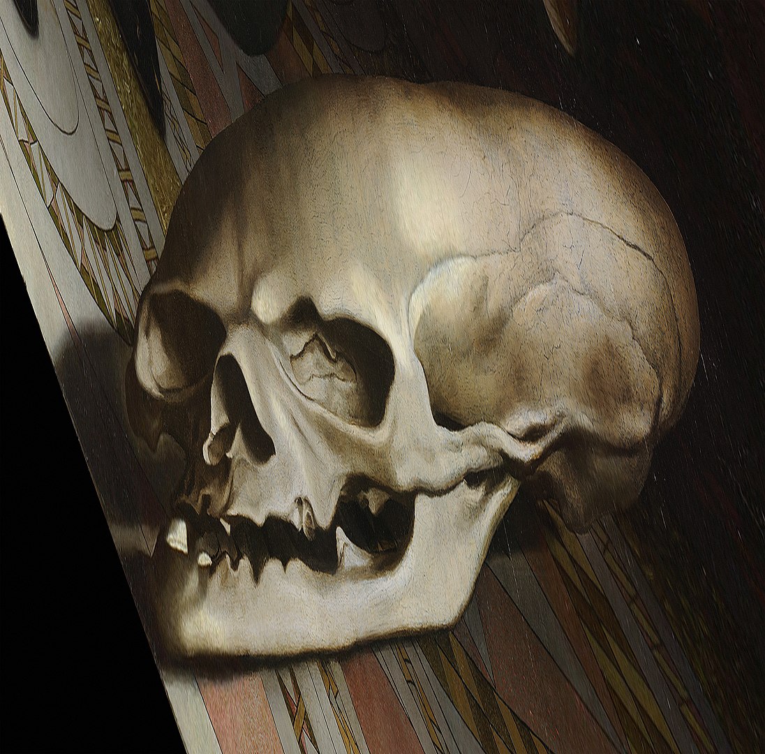
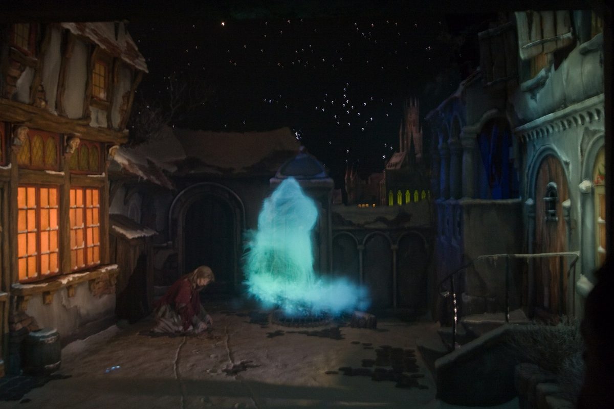
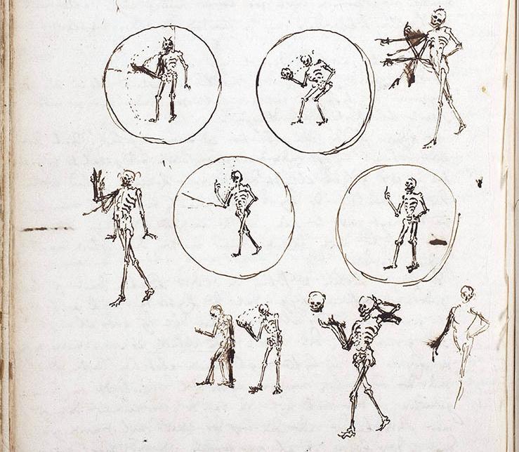
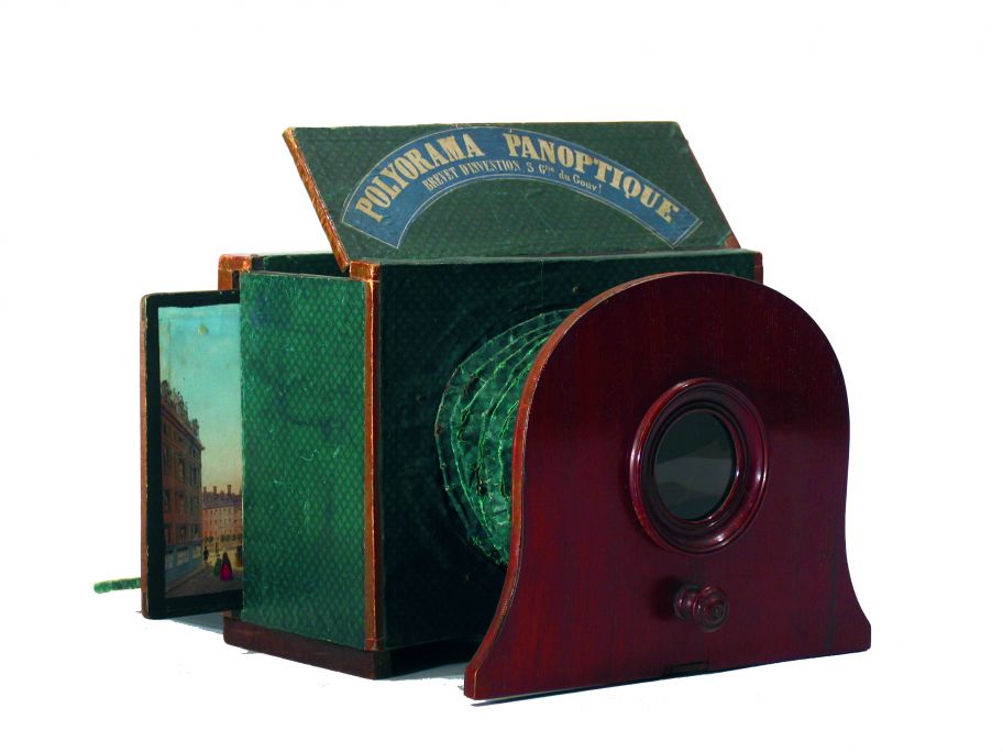
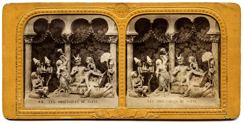
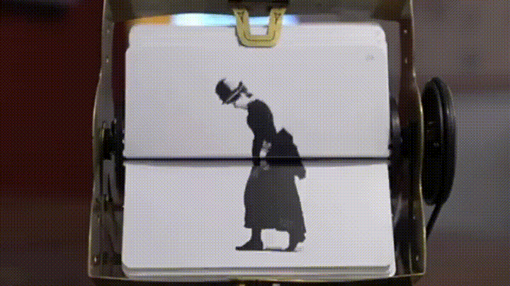
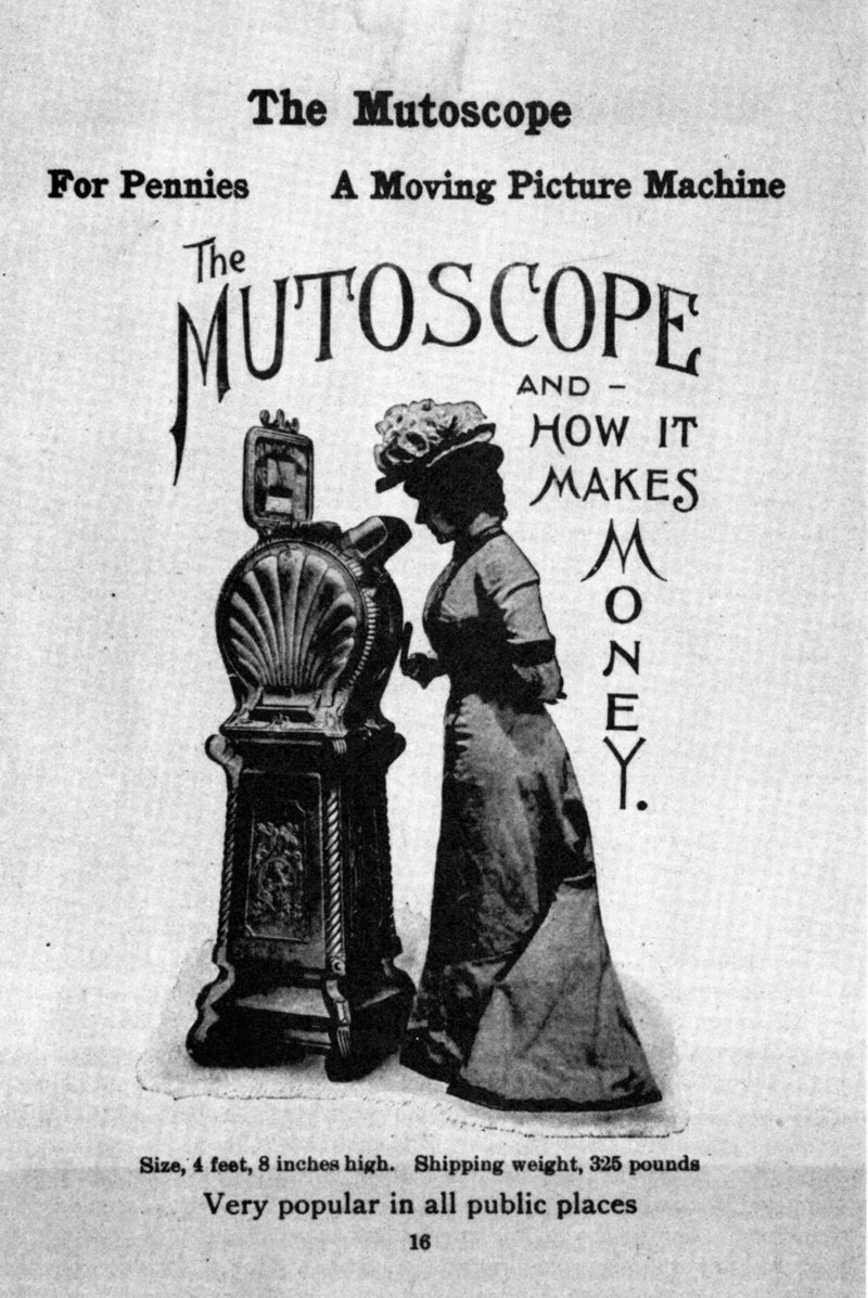
The 19th century popularity of eccentric depictions of skewed historical events and fantasy scenarios extended to an exhausting variety of portable entertainment devices, such as peep shows (viewing boxes, sometimes made of paper that could be folded out), diableries (stereoscopic 3d images featuring dancing skeletons, inspired on the Medieval danse macabre), and dark fairy tales told through magic lantern projections.

In the curatorial text for ‘Smaller Worlds. Diorama in Contemporary Art’ these are described as: “Here, the mischievous thrill of voyeurism meets other-world-ly mystery and the absolute control over this fantasy world. With their secrecy and obscurity, peep shows were able to show the unspeakable and undepictable, hence becoming the form of expression for grotesque and horroristic fiction over time.”

Can Togay, in his opening speech for the exhibition, quotes the protagonist in the opening chapter of Herman Hesse’s novel ‘Steppenwolf”: 

“In one of the quietest and oldest quarters of the city, he suddenly catches sight of a small gate with a pointed arch. He stops and takes a good look. Then he sees a patch of soft light above the gate, with colourful letters flickering… He manages to make out a few words:

Magic theatre 

Not for anyone

– Not for anyone!

He tries to open the gate, but the heavy old handle won’t let go, no matter how hard he pulls. He backs away. When he steps out onto the pavement again, a few coloured letters of light spill onto the gleaming asphalt. He reads them:

For f-o-o-l-s only!

He moves on, shivering and longing for a magic theatre that only opens its doors to the insane.”

With Daguerre’s Diorama explicitly part of the entertainment industry and the habitat displays sharing the same name and some of its illusionary qualities, it’s understandable there was a need to distinct both types.

Lehman, as an advocate of scientific exhibits of animals, of course distanced himself from the “imbecilic (panopticon) that only satisfies sensual pleasures”.

In 1903, at a conference on ‘Museums as sites of popular education, Lehman presentented his views on the function of his Altonean museum for natural history, history, and folklore: “It is not the intention simply to convey a certain quantity of facts, but to educate the museum’s visitors into thinking humans; they should become accustomed to observing, in order to understand nature.”

Lehman was influenced by the development of the philosophy of perception in educational psychology reflected in the German concept of Anschauung: “an intuited sense of the world mediated through vision.” 

In the case of Lehman’s Altona museum, his exhibition strategy resulted in habitat groups rather than dioramas, but the argument is similar. In 1906 and 1907, Wandolleck repeatedly accused Lehman of sacrificing science for drama. Using the Altonean museum display showing a wolf attack on elks he argued that if a scene would be true, it had to have been observed. Since both elk and wild wolves were extinct at the time, disappearing with much of the primaeval forests in Germany in the 18th and 19th centuries, the scene was a mere product of the imagination.

(Insert: the prehistoric life diorama at AMNH? The diorama as a time-machine)

Oppositely, Lehman rejected Wandolleck’s clear distinction between “scientific truth and artistic imagination.” Lehman sought to capture something more than an accurate representation; he was looking to provide an ‘authentic’ experience for the viewer. But what is ‘authenticity’ in relation to a simulation? 

Nyhart uses a large coral reef diorama in the Oceanography Museum of Berlin to explore this question: “Here we see how the products of artifice – in this case background paintings – served to reinforce two aspects of authenticity. The scientists’ claim that the scene is the ‘real thing’, strengthened by visual references to specific locations, was brought together with the feeling that was intended to be experienced by the visitor, that the scene looked and felt emotionally like ‘the real thing’”.10

Nyhart writes: “Authenticity (…) involved at once the scientist’s authority in saying something was true and accurate, the preparator’s or artist’s skill in reproducing and provoking that truth, and the viewer’s intuitive experience of the scene as true. Naturalists (…) held fast to the belief that the experience of authenticity required contact with at least a remnant of an ‘original thing’ in the display. Ultimately, that conviction (…) is what has given the natural history group display its immense and long-lasting power.”11

But, as Nyhart notes, the still unresolved tension between scientific accuracy (science) and imaginative representation (fiction) has a political dimension, too: “(…) whose interests, ultimately, was the museum to serve – the scientist’s or the visitor’s? Whose truths should be striven for?” ((Nyhart, Natural history displays, Models. The Third Dimension of Science, p. 325.))

Colonialist connotations: The Diorama Dilemma

Circling back to the introduction essay for the 2017 Dioramas exhibition, ‘Exposer l’Absence’, the third reason for the absence of the diorama in an art historian context is the ambiguous ‘morality’ that comes with the habitat diorama’s colonial connotations that, over time, seemed best to be avoided. This, in itself, is a web of contradictions and, in the case of museums across the globe – of natural history, art history, ethnography, and contemporary art alike – has throughout the last few decades increasingly become an ongoing reinvestigation of collections and displays.

A polyphony of stories that does not harmonize: Donna Haraway’s The Teddy Bear Patriarchy

Between the late 1800s and 1930, the largest concentration of habitat dioramas was found in Sweden and in the US. This is explained by Wonders “(…) by the fact that unspoilt landscape and wildlife were more plentiful in Scandinavia than elsewhere in Europe, and had become a major parameter of national identity; as pristine wilderness was vanishing under the onslaught of industrial progress, biological exhibitions of specific, regional habitats functioned as archives of cultural riches.”

Wonders continues: “The same was true for the US. The national identity of the US has always been closely associated with the magnificence and vastness of its wilderness regions and with the seemingly unlimited amount of wild game inhabiting these. To recreate wild animals—both birds and mammals—and their natural environment in the museum, meant preserving a major part of the national heritage.”12.

“There’s a polyphony of stories, and they do not harmonize.”, as Donna Haraway puts it in her 1984 essay ‘The Teddy Bear Patriarchy: Taxidermy in the Garden of Eden, 1908-36’. In this essay, Haraway thoroughly deconstructs the dioramas in the Akeley Hall of African Mammals in the American Museum of Natural History (AMNH, in short) in New York, and the Theodore Roosevelt Memorial in the same museum.

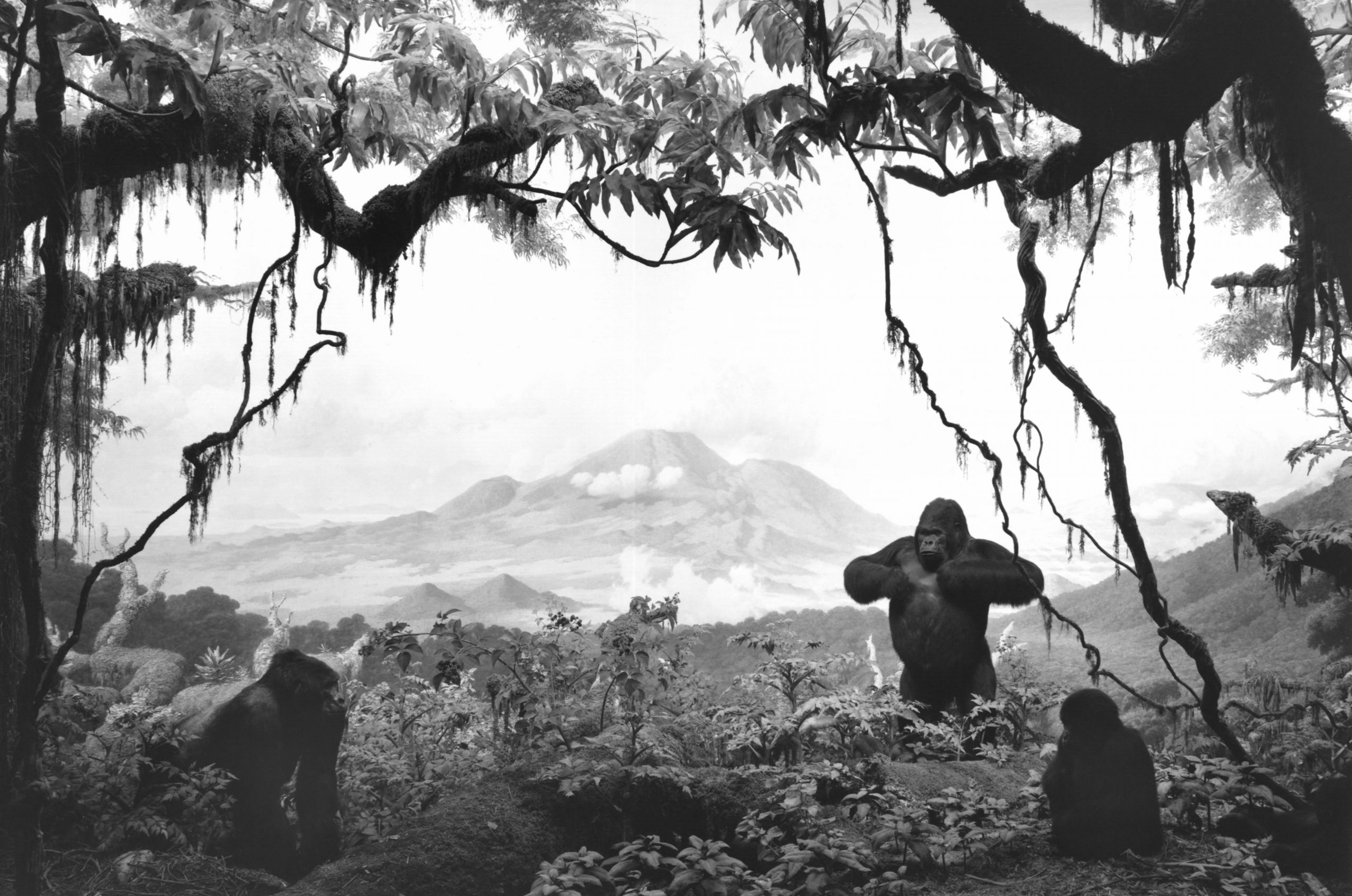
A central figure in the text is Carl Akeley (1864-1926), who is known to have created the first habitat diorama for a science museum, the Milwaukee Public Museum, in 1889. He went on to design the Akeley Hall of African Mammals in the American Museum of Natural History in New York, where he became the founder of the AMNH exhibitions lab. The AMNH is internationally recognised for its immense amount of dioramas of a stunning illusionary quality.13

Akeley was a conservationist and a hunter, a combination that was, and still is, frequent and returns in the chapter ‘Himalaya at Dawn’ through the person of the British major Percy Powell-Cotton, of who is “noted for bringing an extraordinary number of animal specimens back from his travels across Africa, potentially creating the largest collection of game ever shot by one man.”14

Akeley, too, shot many of the animals for his displays himself, most notably the silverback gorilla ‘The Giant of Karisimbi’. 

Haraway uses the figure of Akeley and his entourage – which includes his wife Mary Jobe Akeley, who was an explorer in her own right and wrote many of his books – and the dioramas in the Hall to take a critical look at the dynamics of colonialism, racism, white supremacy and patriarchal dynamics in the fields of science.  

Akeley was also a photographer and filmmaker, inventing a new type of movable camera that could be wielded in barely accessible natural environments in order to ‘visually’ collect animals for scientific research. Using the killing of the gorilla group in central Congo (now Zaïre), Haraway connects the hunting rifle (through the vision of “man, the hunter”) to the camera lens; not just the lens of the nature photographer, but also of the visitor in the AMNH that takes a snapshot of a diorama.

The hunting of the gorilla group near the Virunga volcano in 1921 had an existential impact on Akeley, causing him to persuade the Belgian king Albert II to turn the area into the first African National Park, modeled after the national parks of the United States. Haraway reconstructs Akeley’s very first encounter with the notoriously elusive gorilla: first, there were the footprints – traces that look like handprints in the mud – and within minutes of its first sight, Akeley had killed him.

Hiroshi Sugimoto, ‘Gorilla’, 1994 © Sugimoto

This haste perhaps was fuelled by the news that the prince of Sweden had recently shot 14 gorillas, and the realisation that “collecting might be very difficult”. Akeley was already very much aware that a supply of gorillas wasn’t infinite. 

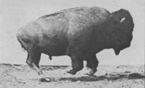
By the 1880s, the North American continent was entirely colonised (“the closing of the Western frontier”), resulting in the near extinction of bison and the complete extinction of the passenger pigeon in 1914. The publication ‘Windows on Nature’ (2006), issued by the AMNH and focusing on the history and construction of the dioramas in the museum, notes: “Entire populations of waterfowl and shorebirds had been wiped out by intense and unregulated commercial hunting. Big game animals such as deer, moose, bears, elks, and antelope shared similar fates, as no regulations were in place governing when they could or could not be hunted. The millinery (hat-making) trade annually killed hundreds of thousands of nesting egrets, terns, herons, and other bird species for their beautiful nuptial plumes. Scientists and government leaders were spurred to action.”

At the same time, social changes including the start of the emancipation of the working class, took place, and Haraway writes about this: “Akeley and his peers feared the disappearance of their social world in the new immigrations after 1890 and the resulting dissolution of the old imagined hygienic, pre-industrial America. Civilization appeared to be a disease in the form of technological progress and the vast accumulation of wealth … by the very [same] wealthy sportsmen who were trustees of the [AMNH] and the backers of African Hall.”15

A contrast appears between the portraying of the figure of Akeley by Haraway, in 1984, and Quinn in AMNH’s ‘Windows on Nature’ in 2006. Haraway views Akeley as an extension of the colonialist machine, an almost tragic figure locked between the dominant sense of superiority of the Western civilisation and its scientific order, and an utterly romantic longing for finding his place in the natural world.  

Quinn celebrates Akeley as a passionate conservationist, an adventurer willing to sacrifice his health – he was mauled by a leopard, and almost fatally attacked by an elephant – for science. Here, Akeley emerges as a real-life Indiana Jones. 

Author Maria Golia summarizes Akeley’s position in an essay for the platform Engelsberg Ideas: “Akeley could justifiably claim the title of naturalist; he studied animals in the field, recording his observations, and was instrumental in convincing the government of Belgium-colonised Congo to establish a wildlife park, Africa’s first, to conserve the gorilla habitat. He was nonetheless susceptible to expectations concerning manhood and sportsmanship, whereby killing animals was viewed as a gesture of respect, the facing of a worthy foe.”16

Throughout the 18th, 19th, and early 20th century this duality was common in almost every scientist–explorer: even though he was a reluctant expeditionist, Charles Darwin, too, was an avid hunter, sending home crates with thousands of exotic birds and insects from his Beagle journey. Unsurprisingly, collecting animals for science in some cases caused the extinction of species, in particular on the vulnerable ecosystems of islands. 17

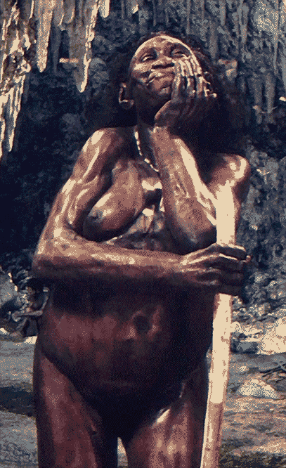
The most controversial, and in current times rightfully fiercely rejected form of ‘natural history’ displays, were of course the inclusion and portrayal of the indigenous people the expeditions encountered. 

Notorious are the human zoos, of which the ‘human zoo of Tervuren’ was the last. During the world fair of 1958 in Brussels, 150 people from Belgian Congo – then still a Belgian colony – were ‘exhibited’ in the confinements of an imitation of a Congolese village, and subject to daily abuse of the visitors. Two years later, Congo became independent.

The most extreme example was ‘El Negro’, a Tswana warrior, ‘collected’ and taxidermied in 1843, and who was shown in the Darder museum for natural history in the Spanish town of Banyoles until 1997.18

“As I was on my way to the Human Room, an annex of the Mammal Room, past a climbing wall with apes and the skeleton of a gorilla, my merriment gave way to a shudder. There he was, the stuffed Negro of Banyoles. A spear in his right hand, a shield in his left. Bending slightly, shoulders raised. Half-naked, with just a raffia decoration and a coarse orange loincloth…”, journalist Frank Westerman writes in ‘El Negro and me’ (2016).

“… El Negro turned out to be an adult male, skin and bones, who hardly came up to one’s elbow. He was standing in a glass case in the middle of the carpet.

This was not Madame Tussaud’s. I was not staring at an illusion of authenticity – this black man was neither a cast nor some kind of mummy. He was a human being, displayed like yet another wildlife specimen. History dictated that the taxidermist was a white European and his object a black African. The reverse was unimaginable. I flushed and felt the roots of my hair prickling – simply from a diffuse sense of shame.”

From ‘Windows on Nature’: “By the late 1950s, however, the popularity of the diorama as an exhibit medium was waning. Dioramas required expensive collecting expeditions and were time-consuming to produce. Many of the species they depicted were becoming so endangered in their native habitat that collecting for display was deemed unacceptable.”19

It is of no surprise that against the background of a reckoning with white supremacy, colonialism, the idolisation of “man, the hunter”, and the biodiversity crisis, the habitat diorama lost its luster. 

It led to the “diorama dilemma”, as ‘Diorama: Exposer l’Absence’ calls it: museums had to decide whether to restore the historical dioramas in their exhibitions, or to remove them. The dilemma centred on the complex relation between the popularity of the diorama with the public and its unique position in media history, and a ‘disaffection’ that arose from the critical discourse. Eventually, many of the dioramas were removed.

In 2018, the AMNH added annotations to the Old New York diorama from 1939, a part of the Theodore Roosevelt Memorial hall. The diorama depicts an encounter between the Dutch Peter Stuyvesant and Oratamin, a leader of the indigenous Lenape. Read more here. Photo by AC / © dioramas by AMNH
  1. Exhibition text taken from the website of Palais De Tokyo. https://palaisdetokyo.com/en/exposition/dioramas/ []
  2.  The text of the speech is included in the (digital) catalogue for Smaller Worlds, which can be found on the website of the Ludwig Museum: https://www.ludwigmuseum.hu/system/files/publication/attachments/2023-01/230123_kisebbvilagok_online.pdf []
  3. Dioramas. Palais De Tokyo, Flammarion, Paris, 2017, p.8 – 13. []
  4. Donna Haraway, The Teddy Bear Patriarchy, Duke University Press, 1984, p. 34 []
  5. Karen Wonders, Habitat Dioramas: Illusions of Wilderness in Museums of Natural History. Uppsala: Acta Universitatis Upsaliensis, 1993. []
  6. Norman M. Klein, The Vatican to Vegas. A History of Special Effects. The New Press, 2004. p. 5 (introduction). []
  7.  Donna Haraway, The Teddy Bear Patriarchy, Duke University Press, 1984, p. 21 []
  8. Lynn K. Nyhart, Science, Art and Authenticity in Natural History Displays, Models, Stanford University Press, 2004. p. 307 []
  9. Lynn K. Nyhart, Science, Art and Authenticity in Natural History Displays, Models, Stanford University Press, 2004. p. 313. []
  10. Nyhart, Natural history displays, Models, p. 325. []
  11. Nyhart, Natural history displays, Models, p. 331. []
  12. Wonders. Habitat dioramas as ecological theatre, p291-292 []
  13.  Quinn, Windows on Nature, Abrams/AMNH, 2006, p. 15. []
  14. A quote from Powell-Cotton’s Wikipedia page, reference: The Companion Guide to Kent & Sussex, 1999. []
  15.  Donna Haraway, The Teddy Bear Patriarchy, Duke University Press, 1984, p _ []
  16. Maria Golia, Carl Akeley – the contradictory life of a taxidermist and hunter turned wildlife photographer, published September 16, 2021 on Engelsberg Ideas. https://engelsbergideas.com/portraits/carl-akeley-the-contradictory-life-of-a-taxidermist-and-hunter-turned-wildlife-photographer/ []
  17. David Quammen, ‘The Song of the Dodo. Island Biogeography in an Age of Extinction’ []
  18.  Frank Westerman. El Negro en ik. []
  19. Quinn, Windows on Nature, Abrams/AMNH, 2006, p. 21. []

WAGMI: an awkward dance of art and crypto

Originally published in HART magazine #222, March 2022 in tandem with the first of a series of columns highlighting a digital work from my NFT collection. Read the Dutch version on their website. WAGMI stands for ‘We’re All Gonna Make It’ or ‘We Are Gonna Make It’. It’s often used in relation to crypto investments. Image: Lorna Mills, Cofveve, animated .gif, 700x700px, 10fps, 2020.

Alexandra Crouwers

As it turns out, much of the turmoil surrounding the NFT—the non-fungible token, often erroneously dubbed crypto-art—arises from a wide range of misunderstandings. Since Spring 2021, I’ve actively been exploring the phenomenon from the perspective of my professional artistic digital practice, which took off in 1998 with a discarded office computer and CorelDraw. This resulted not only in an explosive network expansion but also in a growing digital art collection. As with all things, this virtual field is endlessly more nuanced than it may appear from the outside.


An NFT is not a new medium posing an existential threat to painting or sculpting but simply a way to distribute digital files with a certificate of authenticity by its creator, immutably and publicly recorded on a blockchain. The file can be anything from a screenshot of a Tweet to a snippet of code or a rental agreement. But it can also be a purchase contract for art. Cryptocurrencies, too, are connected to blockchains and are equally elusive and immaterial in nature as digital art. Apart from these substantive similarities, crypto-investors often deploy pump and dump tactics that are reflected in some areas of the physical art market, despite its aura of civilized decency. And this is how an explorative segment of the visual arts has gotten itself into an awkward and sometimes overly excited dance with crypto. 

Much of truly digital art has barely any means of existence outside of the realm where it was produced. You can’t print a .gif animation, and it’s impossible to touch an augmented reality piece. Code doesn’t manifest itself in real world coordinates. These works live where they were born: in strings of zeros and ones, visible on the screens of (mobile) devices.

For artists like me, whose process and production largely take place in—and relate to—a virtual environment, the NFT provides at least a partial solution to a problem. NFTs allows me to distribute—and yes, also monetize—works that had trouble finding a logical destination before. By applying my ‘stamp’ of authenticity, I’m telling everyone this file is made and provided by me. The stamp manifests itself as metadata and is comparable to, for instance, a signed and numbered silkscreen edition. 

But what about that exorbitantly high energy consumption that has become synonymous with crypto? Well, my work centers on ecological collapse and the planetary climate crisis; there was no way I would have, or could have, engaged with the NFT space if not for alternative blockchains such as Tezos, where a transaction uses less energy than sending a Tweet. And since I’m not alone in this, within less than a year, a dynamical ecosystem arose from thousands of artists, developers and collectors moving between platforms such as versum.xyz, teia.art, and objkt.com. This part of crypto space behaves like a global artist-run space, and is quite different from the, still to me too, peculiar trade in pfp projects so often associated with NFTs.

This brings me to my collection. Almost every earning from the sales of my own works—which I offer for quite democratic prices, since I’m considering this space as a fascinating experiment in progress—flows back into the ecosystem via my purchases of works by colleagues from all over the world. This includes work by monuments of digital art but also by lesser known, anonymous or sometimes very young creators still trying to find out where they fit in or outside of the fine arts context.

It may be difficult to grasp for people less familiar with digital matter but the sense of ownership is surprisingly similar to owning a physical art piece. Like some sort of meta-archivist, the blockchain adds my name to a work the moment I acquire it. The NFT is the handshake between artist and collector, and establishes a bond between us. Confronted with increasingly overwhelming amounts of digital visuals, it can be hard to locate meaningful and interesting trajectories. A digital picture is not automatically ‘art’ and it takes some good old-fashioned knowledge of the new media landscape and wider art history to separate hollow promise from relevant, more layered practices. 

In a series moving in tandem with the paper edition of Belgian art magazine HART, a selection of my collected pieces will be presented on its website, in a new series called Bits & Pieces. It’s a modest act of resistance against the prejudice still preceding the digital fine arts—and the NFT for that matter—and a nice way to highlight art that is distributed through this new phenomenon.

The Plot, The Compositor, and Mourning/Mistakes

VIS #6 – Theme: Contagion

VIS is launching issue #6 (Editor: Anna Lindal) with the theme “Contagion” during Artistic Research Autumn Forum in Trondheim on 19 October.

This is a peer-reviewed publication. Reviewer: Sepideh Karami.

Issue: 6
Theme: Contagion // Smitta
Editor: Anna Lindal
Release: Tuesday 19 October, 17:00 – 17:45 at Artistic Research Autumn Forum 2021

The issue, which features five expositions, deals in different ways with touch, vulnerability and transmission; contagion becomes a creative and destructive concept in the shadow of the pandemic. A talk about the theme between Editor Anna Lindal and Editorial members Eliot Mmantidi Moleba and Gunhild Mathea Husvik-Olaussen is published in addition to the expositions.

Presenting the issue will be new Editorial members Eliot Mmantidi Moleba and Gunhild Mathea Husvik-Olaussen. Liv Kristin Holmberg will participate with a presentation of her published exposition.

Expositions in the issue:

  • Soft to the Touch: Performance, Vulnerability, and Entanglement in the Time of Covid. Jennifer Torrence
  • Corona Influentia och den mörkare materian. Timo Menke
  • Viral Drawings: Transmission BC / QT / AV. Karen Schiff
  • Smitte som skapelsesmaskin. Liv Kristin Holmberg
  • The Plot, The Compositor, Mourning/Mistakes. Alexandra Crouwers

Alexandra Crouwers, visual artist, begins her exposition at ‘The Plot’, a piece of land where a section of forest was afflicted by the harmful bark beetle Ips typographus. The trees were felled and a clearing was left in their place, a gateway for dealing with ecological grief. The exposition is mobile and non-linear and uses many artistic methods and entry points that invite viewers on a journey that is refreshingly provocative, humorous, and rich with reflections. The exposition is centred on the coordinates of ‘The Plot’ with 3D-models, animations, stills, videos, and GIF-animations.

About this exposition

EN

In the Summer of 2019, a small family forest fell victim to a spruce bark beetle plague. Unusually mild winters caused larvae numbers to explode, and extreme drought weakened the otherwise more resilient trees. Expanding patches of dead forest can be found from the North Sea coast to the Baltics. The cleared forest became The Plot: a witness to climate change, and a gateway to dealing with ecological grief. My own eco-anxiety is utilized as a case study: how to deal with this new kind of loss? What is The Plot telling us? How do we move forward without losing hope? The exposition presents The Plot as fertile ground for artistic and collaborative research, including a contribution by Lisa Jeannin, a custom made font, moving image, and an audio work.


SV

Sommaren 2019 blev en liten, familjeägd skog ödelagd efter angrepp av granbarkborre. Ovanligt milda vintrar har inneburit en explosiv ökning av mängden barkborrar samtidigt som perioder av extrem torka har försvagat de annars betydligt mer motståndskraftiga träden. Hela vägen från Nordsjöns kust till Baltikum finns nu växande områden av död skog. Den ödelagda skogen blev The Plot: ett vittnesmål om klimatförändring och en plats för bearbetning av ekologisk sorg. I projektet använder jag min egen eko-ångest som fallstudie. Hur hanterar vi dessa nya typer av förluster? Vad kan vi lära oss av The Plot? Hur kan vi gå vidare utan att förlora hopp? Expositionen introducerar The Plot som bördig mark för konstnärlig och kollaborativ forskning. Den omfattar ett bidrag av Lisa Jeannin, ett skräddarsytt typsnitt, rörlig bild, och ett ljudverk.

The digital dioramas of the Moesgaard Museum

Aarhus, Denmark. Visited August, 2021.

While searching for examples of contemporary habitat dioramas, I stumbled upon a video of Art+Com studios (Berlin, Germany). The two minute single shot animation shows an Australopithecus Sebida in her historical natural environment.

It turned out the video was made as a stereoscopic film for a viewer at the Danish Moesgaard Museum, which his connected to the archaeology department of Aarhus University. The Museum houses a considerable and well preserved Prehistoric collection, notably from the Danish isles.

Moesgaard opened in 2014, and incorporated all kinds of digital displays in its exhibitions. In some cases the scenography seemed to distract a bit from the actual content, but in other’s, the dioramic inventions were quite inventive.

The Evolution Stairway

Although there may be some issues ( 1 ) with the way the evolution stairway is presented, from a display point-of-view this was a beautiful combination of scientific modeling (by twin brothers Kennis & Kennis) ( 2 )and a digital stereoscopic experience.

On of the stereo viewers installed at the Evolution Stairway.

( 1 ) Museum narratives are not neutral by Dolly Jørgensen, New Natures, Sept 29, 2018

( 2 ) The Kennis & Kennis reconstructions of (pre-)historic figures always seem to depict their subjects on the happiest day of their lives.

Kennis & Kennis Homo Floresiensis model in digitally reconstructed habitat.
Alexandra Crouwers, homo floresiensis, moesgaard, digital diorama

Seven 2 minute animations transport the visitor from the concrete stairway in the center of modern building to seven different locations in time. 3D-scans of the physical reconstructions are centered, while the virtual camera circles around them. The films are loops, but cut off at the beginning and the end, where there’s a transitional scene from the stairs to the landscape setting.

The viewer can control a little bit of the experience by turning a wheel on the viewer – but this does nothing more than play the video either forward or in reverse.

The scene is not a veritable immersive VR experience; the metal viewers are static and looking through them does not totally isolate the visitor from their surroundings. It is, however, a really nice animated update of a 19th century stereographic experience. Even the colors have a vintage 1950s, 1960s stereo slides feel to them.

The seven viewers are placed on the balcony around the stairs, each pointing at another human ancestor or relative. Because the viewers themselves are grey and quite inconspicuous, many visitors seem to overlook them entirely.

Other diorama’esques

The sequence above is based on a 5 minute ‘show’, accompanied by somber narration. It describes a year in a Prehistoric life, and it was a pretty well done combination of theatrical diorama tradition and science.

I’ve filmed a couple of other inventive presentations (making use of a modest type of projection mapping), but it turned out the LED lamps used caused the footage to induce a headache because of the resulting flicker. Instead, I’ll describe them below:

Island.

A circular relief, projection from above.

The voiceover spoke Danish, so I’m not entirely sure what the narrative was, but life-sized footsteps appeared as a track in sand, which then transformed in a small stream with rocks and foliage, which then transformed in an island – meaning the scale moved from life-sized to miniature, or our perspective shifted from frog to bird.

Holochurch.

Over a miniature model of a town, a church and a modern building appeared and disappeared in dissolve-like intervals.

This is a classic ‘Pepper’s Ghost‘, using a reflection in a glass pane to achieve a holographic effect.

See-through heads.

This display is related to ‘Pepper’s Ghost’: it uses a semi-reflective glass mirror to achieve a ‘double exposure’ image of a skull and its reconstructed fleshy head.

The Unreal: first notes on Non-Fungible Tokens

To be honest, until two months ago I had never heard of ‘crypto-art’ or ‘NFTs’. For someone who spends an awful lot of time in the digital realm thinking about screen-culture, this is a bit of a blamage. I’m blaming my blind spot for Twitter, which is apparently where the crypto-action is.

What are NFTs? There’s a growing amount of explainers on the internet, which saves me time. Here’s one on The Verge, for instance.

In any case, the NFT entered my – and undoubtedly many other’s – field of view as Beeple’s compilation piece ‘Everydays: The first 5.000 days’ got auctioned at Christie’s for the equivalent of 50 million Euro in the cryptocurrency of Ether. It was bought by this guy, who defies all laws of the perception of super-wealthy art collectors.

The media-frenzy that followed, and – as the media does – keeps a keen eye on the money, dragged the NFT into the mainstream. 

Cryptocurrency is abstract enough, but the NFT makes it almost impossible to explain its importance, its characteristics, its issues and troubles to digital laypeople. It took me over two weeks of intensive online-reading to more or less get a grip on the subject, which is still in its infancy.

Depending on who you ask, the NFT is a Ponzi scheme or a replacement model for the current art market. As usual, it’s all of that and something in between. 

All I can say is that for me, and many visual artists whose works arise digitally, the NFT is a solution to a problem that has been haunting me since I started working with the computer:

In what form can a digital born work live in the physical world?

OBJKT#28370
collect for 1 tez
Fundamental Mechanics (0)1/52

Immersive video-installations are relatively compatible due to the suitable immateriality of the projected image. A more complicated in-situ example of a digital video work made material is the privately commissioned ‘Chisel‘.

The ‘Three Motions of Loom’ tapestries I made at the Textielmuseum in 2019 were a successful translation of a digital file to a physical object because of the close relation a jacquard weaving machine has to a computer. The vinyl record ‘The Compositor’ (2020) is another.

The Compositor/Composing, audiofile on 12″ vinyl record/engraving, 2020.

But as much as I love paper, a print of a digital image has more often than not felt like too much of a compromise. The work becomes something entirely different; it’s barely recognizable. And while projecting video can be a suitable way to export a work, not all animations are meant to be immersive, or work on a screen in an exhibition space.

An interesting case is ‘Fundamental Mechanics’, a series of ultrashort animations I made using the built-in Instagram Stories feature. For me, this was a great way to experiment with animation on a consumer technology level: what is possible within the limitations of the size and bites of a mediocre smartphone, the available emoji and stickers from the Giphy database?

It turns out, quite a lot. I liked the series so much, I turned it into a video on a rather ‘crappy’ open frame screen, the screen being an integral part of the work.

But there’s something not entirely right with this presentation. The animations work best where they belong: on a computer or mobile device screen.

In short: there’s a plethora of artistic output in the form of finished works, sketches, setups, ideas and side-trajectories hidden in the hard drives of my computer(s), that have nowhere to go in the RW. 

And this is what excites me – and some of my great fellow-digitally-working-artists – so much about the NFT; it finally gives autonomy to the digital image, allowing it to exist on its own terms. The digital born image is mostly at home in its digital habitat. 

At the moment, the NFT scene is exploding: there are a range of curated and open platforms working with various cryptocurrencies, which host an inevitable amount of superficial visual junk an adventurous artist or collector has to wade through in order to find some substance. This is part of the frenzy a new medium entails. I’m very curious as to where this will all go. At the moment, developments are moving with lightning speed, so the whole field might look completely different in six months.

After careful consideration, I decided to start minting NFTs on the platform hicetnunc.xyz, because it works with a hugely less energy-wasteful crypto coin: XTZ (Tezos), and because the platform is open for everyone.

Notes and issues.

At the moment, most NFTs are made on the Ethereum blockchain, which – like Bitcoin – uses a PoW protocol. Proof of Work is exactly that: it takes a huge amount of calculations to authorize a work. This means that the energy consumption is outlandishly high. There are alternatives, though, that use PoS (Proof of Stake). Those less known cryptocurrencies, such as Tezos, bear a fraction of the environmental load. 

Media attention for NFTs is, in the regular media at least, connected to financial anomalies. Many NFTs are available for the equivalent of € 5 – € 50 euros. 

The curated platforms seem to select in part on the amount of social media followers an artist has, which reflects the way the physical art market works: size, apparently, does matter. This advantages the more commercial creators, or creators who’re social media savvy. These people are ‘dropping’ NFTs for limited amounts of time in large quantities, for instance, while making a lot of noise about it online. This quantity before quality machismo is, at least for me, terribly off-putting.

This takes me to another issue: although the NFT world, like cryptocurrency, embraces decentralized ideas of ownership and connects this to a sense of inclusiveness, the digital art world is still dominated by very traditional patterns: male, mostly white. I would really like to stress that any woman working with digital media should not be scared off by the aforementioned machismo. 

On the other hand, men, women and everything in between are trying to jump on the bandwagon, resulting in crypto-fluent creators minting digital photos of their aquarel paintings or hastily made ipad-filtered portraits.

Am I climbing on a high horse when I consider those to be faux digital art? 

To be continued…

To diorama or not to diorama? The representation of nature at the Museum of Natural Sciences in Brussels.

A review of the ‘Living Planet‘ hall, at the Museum of Natural Sciences in Brussels, visited in January 2021.

In September 2020, The Museum of Natural Sciences announced a new permanent exhibition called ‘Living Planet’. This addition even made the news. The museum is very proud of it.

The Living Planet exhibition’s main hall.

Unfortunately, all I saw was a terribly perverted way of presenting ‘nature’ to an already vastly urbanized audience, with an emphasis on children. I found it utterly dystopian.

Taxidermic specimens are exhibited as if they’re part of a contemporary art show: isolated, without context, in a white, unimaginative space. The immense gap between the perception of us, humans, compared to the rest of the animal world is made painfully clear. Touch screens – probably broken within a couple of years – gave minimal information on the individual species or their relation. The installation looked more like a high-end shopping mall.

Compared to this presentation, a zoo seems like a reasonable environment for wild animals. For other parts of the exhibition an array of abstract video projections of water or fire and close ups of plants were used – again as if they were channeling Bill Viola’s work in an attempt to achieve ‘immersion’. Immersion in what? In videographic exhibition design? All this equipment and styling will be outdated within a blink of an eye.

Half baked, stylized references to the traditional natural history dioramas were put in place, without even trying to aim for any form of illusion of a species in their actual habitat. Perhaps the museum thought to emphasize the laboratory part of natural science, but this completely disregards the engagement of natural sciences with actual natural environments.

Animals are being cut loose from their landscapes, all references to endangered ecosystems are gone or at least filtered out by colored led lights, the space for that replaced with white void or exhibition design that looks like it was conceived by tv studio builders. Maybe they simply thought it was ‘edgy’, in which case I wouldn’t even know where to begin to address a shallow mishap like that.

This is not worthy for any museum of natural history or natural sciences of this scale. This is an attempt at turning natural sciences into a multimedia theme park, while increasing the already substantial distance between the audience and its relation to wilderness.

In any case, ‘Living Planet’ is the worst title for a department pretending to represent life in dead, technological spaces.

See photos for observations.

Above: this is how the visitor enters the Living Planet exhibition. Note the prominent placement of the light rail and air vents, emphasizing the similarity to an art fair booth.
The butterfly glass box looks more like a window display for a taxidermy store. The relation between the various animals in the presentation is also unclear. Touch screens and short texts provide little extra information.
The next space is filled mostly with mirroring walls and big projections of close ups from plants.
The display, with small texts and a lot of graphic design is well lit, while the taxidermic hare is banished to a dark spot on top of it. The plant shadows are made by led lamps aimed at wooden cutouts.

Compare the presentations of the Museum of Natural Sciences in Brussels and the American Museum of Natural History in New York below.

After I posted some images with critical captions reflecting the text above via the Instagram stories feature, in which I tagged the museum, the museum sent me a personal message:

Dear Alexa,

Thanks for your critic remarks. As museum we want to show our visitors that biodiversity is important; we want to do so, not by mimicking nature (it is just not possible to do that in a building *), but by using a large variation of museological means: video, animation, games but also naturalised collections. In that first part of the gallery we would like to amaze visitors with the incredible diversity of life on earth. In the other parts we highlight the connection between life forms, and the vulnerability of ecosystems.

All the specimen we are exhibiting have a scientific value; thanks to them scientists can enhance our knowledge of what biodiversity is. Without knowledge we wouldn’t know what and how to protect. We are convinced that those naturalised specimens deserve a place in the exhibition hall, instead of being stocked in the scientific conservatory. No specimen has been killed for the exhibition; they died of old age or disease. Kind regards, the Museum team

(* link by me)

To which I replied:

Dear museum team, I think you misunderstand my criticism – my modest amount of followers know that I’m working on a PhD in arts (in digital animation no less, at KU Leuven/LUCA School of Arts Brussels) focusing on simulated nature and dealing with ecological grief. The habitat diorama is one of my research fields, and I compare the depiction of nature in museum settings. Within his – also scientific – context, it’s just silly to mention the value of taxidermic specimen or how they came to be, since I’m absolutely aware of this. My objections are aimed at the presentation, and its implications. I’ve written a more thorough ‘review’ on my Facebook. Social media is not the best means to discuss this, but I’d love to meet with the people involved to hear about the decision making process for the Living Planet hall. Best regards!

As of today, I haven’t heard back yet.

Introducing: The PhD team

Updated September 2021 to replace Agnieska Gratza with Sepideh Karami.

Promotor: Wendy Morris (SA, BE)

Wendy Morris is a visual artist, a professor in contemporary arts at the University of Leuven, teacher and researcher at LUCA School of Arts, Brussels and founder of the research constellation Deep Histories Fragile Memories.

She engages with moving images, diaries, letters, drawings and sound works. Her work explores fictional, documentary and autobiographical genres and is concerned with colonial migrations, religious dissent and archeological traces.

Morris completed her doctorate in the arts in 2013 at LUCA School of Arts and the University of Leuven with three animated films and a book of 52 letters. She has shown her work internationally on exhibitions and festivals that include Jeu de Paume, Clermont-Ferrand, Dok-Leipzig and Annecy. In 2016 she had a solo exhibition, Off by Heart and Out of Breath, at Argos Centre for Arts and Media in Brussels. The year after she had a solo exhibition at Mu.ZEE in Ostend, titled: This, of course, is a work of the imagination, in collaboration with GoneWest and VAF.

Morris is currently working on reconstructing the plant knowledge of a 17th century South African midwife, but her intermedial practice involves so much more than that. Visit www.nothingofimportanceoccured.org for context, www.midwif.deephistoriesfragilememories.com and our dhfm research blog for collaborations, knowledge exchanges, events and updates.

Travelogue of the Wandering Womb, her Fantastic Encounters and Curious Utterings (2019). Courtesy Wendy Morris. Vocals and composition: Mariske Broeckmeyer. Notes for the Wandering Womb: Wendy Morris. Installation view Alias, Netwerk, Aalst.

Co-promotor: Jan Verpooten (BE)

Jan Verpooten did a double PhD in philosophy (KU Leuven) and biology (University of Antwerp). He’s interested in the evolution of artlike behavior in humans and animals, and presently a researcher and manager (coordination H2020 EU-project Pop-Machina) in BEE – Behavioral Engeneering at the KU Leuven. See more here.

“The Art Observation Post – AOP is a fibre board box in which an observer can take place to collect data on art event typical human behavior. My father, Gert Verpooten, designed and constructed it on the basis of my general instructions. Essentially, it had to be watertight and transportable, as I was going to use it for observations during the Kunstvlaai, an outdoor art fair in Amsterdam. “

Advisor: Theun Karelse (NL)

Theun Karelse studied fine-arts at the Sandberg Institute in Amsterdam before joining FoAM, a transdisciplinary laboratory at the interstices of art, science, nature and everyday life. His interests and experimental practice explore edges between art, environment, technology and archaeology. Lately he has been creating research programs that consist of fieldwork as a means of critical reflection. For this diverse teams are established to address specific topics in specific locations by in-situ prototyping, experimentation and direct perception. Visit his website here, and find more here.

Intro video to the research program ‘Random Forests’, looking at environmental machine learning.

Advisor: Sepideh Karami (UK)

Sepideh Karami is an architect, writer, researcher and teacher, holding a PhD in Architecture, Critical Studies, from KTH School of Architecture. She developed her thesis Interruption: Writing a Dissident Architecture, through writing practices and critical fiction understood as political practices of making architectural spaces. Having been committed to teaching, practice and research in various contexts, she is currently a Simpson postdoctoral fellow at Edinburgh School of Architecture, working on Decolonizing Infrastructures.

Visit her website ‘Troubled Sites here.

Image © Sepideh Karami, 2019.

The Compositor collaboration

Ips typographus (‘de letterzetter’, or The Compositor) is a small beetle, that lays its eggs in spruce bark. Its larvae eat themselves a way out, leaving intricate tunnel patterns. A healthy tree fights off these otherwise useful beetles, but the drought of the last couple of years weakened the trees. All over Europe dead or dying spruce forests can be found.

The Plot (see also here) was cleared last year because of an Ips typographus plague. I’ve collected pieces of bark displaying these almost hieroglyphical alien alphabets.

What are they telling us?

To get a grip on what these hieroglyphs are trying to tell us, a variety of works is being made, departing from the tunnel patterns.

Letterzetter: De Font Maker

Jeroen van der Ham, working as Joebob Graphics designed the published version of my graduation paper in 1998. His speciality is turning hand written letters into usable fonts which keep the flaws and mistakes of handwriting. Names of his fonts include: Dearjoe, Old Letterhand, Coalhand Luke (you can tell there’s some sort of cowboy and Western connection here), seriousSally and serialSue, mixtapeMike, onetrickTony, moanLisa, and fancyPens. At his Instagram account he’s collecting sightings of Joebob fonts under the hashtag #lostandfont. I’ve always been impressed with the use of dearjoe 2 in Grand Theft Auto Vice City.

“As I strutted along the virtual streets of Vice City I suddenly noticed my dearJoe 2 font was used for the Malibu bar display.” (text & image Jeroen van der Ham).

He’s the perfect person to turn Ips tunnels into letters. I want the font to be about 26% readable. The font can be used as initials, but also to produce ‘hidden’ texts: text that look like patterns at first, and only can be read with some effort.

At Joebob’s office in Den Bosch (NL) in September 2020. Jeroen studies some Ips bark here.

Emoji proposals

Attempting to make artistic additions to the internet and consumer technology: the emoji.

In June 2020, I submitted two proposals for emoji, to be added to the expanding digital pictogram vocabulary. Unfortunately, Unicode, the organization responsible for the standardization of digital symbols, declined both proposals in its first selection rounds. 

Stone Tool emoji proposal
Hand Stencil emoji proposal

Unicode adds a selection of emoji each year, based on incoming proposals. Anyone can submit an idea for an emoji. The total selection procedure can take up to a year from submission to implementation. Many devices and apps use their own design sets for emoji, so the proposal is more a conceptual defense than a design challenge.

The Stone Tool and Hand Stencil proposals were deemed to be used not frequently enough for implementation, although I argued their conceptual merits would outweigh those, since especially the prehistoric cave art of hand stencils are the first examples of pictograms.

Hands at the Cuevas de las Manos upon Río Pinturas, Argentina. Picture via Wikipedia.

Find the proposals and the Unicode responses here.

195.1 million views

Preface


What are GIF animations and stickers? What is GIPHY? What is an Instagram Story? Why are GIFs used? An overview.

GIF animations & Stickers

Example of an apologetic .gif (by GIPHY Capture)

GIF is the abbreviation for Graphic Interface Format, using the extension .gif. An animated GIF is, simply put, a digital file that loads images into a stack, and is able to switch between layers, creating the illusion of movement.

GIFs are amongst the oldest image formats used on the internet. They were never really meant for animation, but were developed to compress and optimize images for dial-up connections were still slow, and data needed to be wrapped as tightly as possible in order to get it from one place to another.

This is why GIFs are limited in colors and frame rates. They usually loop endlessly.

GIFs are often made from video frames, and used for making memes by adding text, thus expressing various emotions. Stickers are GIFs with a transparent background. The heading above is a sticker. In this text, when I’m using the term GIF, stickers are included.

GIFs are hosted on internet platforms, so people can easily share them in messages or emails, and through social media.

The largest GIF and sticker database is GIPHY, which was founded as a search engine in 2013 and quickly became to go-to source for all things .gif.

Everyone can contribute to the platform by uploading GIF, but in order to be found through affiliated apps, one has to apply for an artist or brand account.

Uploaded GIFs are – according to the terms – owned by its uploader/creator, but GIPHY holds the perpetual right to distribute them. GIFs can also be modified.

By far most GIF and sticker contributions are uploaded by volunteers – illustrators, designers, meme-makers, artists – though sometimes GIPHY commissions GIFs. In the case of brand content, we can assume the maker has been paid by the brand.

The Instagram stories feature

GIPHY has partnered up with many applications, but none was as successful as the GIPHY integration in the Instagram Stories feature.

Instagram Stories allow the user to share photos or 15 second videos, that disappear after 24 hours. The user can add GIFs and stickers to these images and videos, thus adding an extra layer. By adding a time-base element static images are thus turned into animated images. The length of a sticker-fueled image is 5 seconds.

Users can search for stickers or GIFs by entering tags or keywords. The results are being displayed as a (rotating) selection related to the keywords.

On Monday, June 8 2020, according to GIPHY, the trending GIF is:

.Gif by Bounce TV

While the Popular on GIPHY sticker selection in Instagram Stories shows:

Sticker by Studio Neuheus

Why use GIFs?

People use GIFs to add dynamics to still images, or to convey and amplify an emotion. Brands use them for calls of action, involving text based or pictogram animations such as ‘Swipe’ or ‘Tap here’ or to stress new products and offers. GIFs can also be used as an online extension of activism, a way for people to show support for a cause, such as the Black Lives Matter fist above.

The view count and use of a GIF indicates the public’s involvement with a certain topic, and can therefor be used for commercial purposes. A simplified example: the popularity of the Black Lives Matter GIF exposes a potential market for related merchandise.


1.

The internet is made by people (I)

The internet is made by people. This realization lingers in the codes that make up the websites in our browsers, in the collaborative effort of the Wikipedia project, and in virtually any icon, emoji, or button. Even machine learning, which is often mistaken for artificial intelligence, is often based on manual input of data by a low wages workforce. 1

The most visible human face of the internet is found on social media. Facebook has over 3 billion users, including not only Facebook but also its additional apps: Instagram, Messenger, and WhatsApp. 2

Instagram is an image-based social media feed. It has two types of publicizing posts: either permanent – or until the user decides to remove them – in a grid of squares that makes up your account, or via Instagram stories, where posts automatically disappear after 24 hours. 3

Instagram has gained popularity amongst the visual arts precisely because of its emphasis on image. Its art-following audience often has some budget to spare, and art is increasingly sold through social media, leading to the consumer collector. 4

  • MOMA, NY: 5,1 million followers
  • Louvre, Paris: 4 million followers
  • Banksy: 9,3 million followers
  • Cindy Sherman: 341.000 followers
  • Saatchi Gallery, London: 1,9 million followers
  • Gerhard Richter: 59.800 followers
  • Jerry Salz: 419.000 followers 5

The internet is made by people (II)

Signature of Bernard Hennet, Abbot of Žďár nad Sázavou Cistercian cloister, in 1741, with smiley-like drawing. Image via Wikipedia.

Every image, icon, emoji, GIF or sticker was designed by someone. Often these people are completely anonymous.


Micro movies and limitless boundaries: the boxed loop

The popularity of GIFs may very well be connected to its limits: they’re lightweight, so don’t take up much bandwidth, but the format also provides artistic and conceptual freedom within its set boundaries. Translating complex ideas into a GIF can be challenging, but the animations are quick and easy to make.

Since 2005, I’ve been working with 3d software, using professional programs with serious learning curves. It takes oceans of time to get a grip on even small parts of the medium. In the production of digital animation – including gamedesign -, the visual tasks are split up in specialized teams: texturing, lighting, camera, physics, modeling, rigging, character design, architecture, landscape, and actual animation all have their own departments. It’s virtually impossible to be fluent in all of these components. In my work, for instance, the blind spots are rigging (which is providing a model with a virtual skeleton so it can move ‘naturally’) and complex modeling.

Within my technical limitations, I’m able to work relatively quick: I’ve never worked longer on a film than a few months, though it may contain scenes and ideas that go back years. Still, the film has to be rendered in high quality to keep all the details and to provide a certain illusion of reality – many of my works still seem to puzzle the viewer because they don’t recognize that a work was made digitally, and none of the elements in it physically exist.

Rendering takes hours. And when mistakes are made – which in the early years were many – it has to be done again, and again. After that, there’s editing and post-production, such as color grading. And after that come other renders, to all kinds of digital video formats.

This is part of the trade, and, in a way, a sign of craftsmanship.

A GIF, however, can be made in minutes.


I use a lot of oval shapes in my work. They are eggs, or mirrors, or portals, or holes.

On my mobile phone, I discovered the hole emoji.

Various devices or operating systems use different designs. Since I’m using an iPhone, I stuck with the Apple version.

Originally meaning pictograph, the word emoji comes from Japanese e (絵, “picture”) + moji (文字, “character”). 6

The hole emoji in one of the woven tapestries of ‘The Three Motions of Loom’, 2019


1.

First composition made in Instagram stories. Still image from 2 black hole emoji. March 16, 2019.

In March 2019, I was playing around with the Instagram stories feature. I started by making compositions using the hole emoji, but soon found out I could add small, transparent .gif animations to these images.

This produced ultrashort, 5 second miniature looped videos.

The animations were extremely simple to produce on my phone, by dragging the elements to the desired place on the – quite small – screen.

This was in stark contrast to the elaborate technology of my usual 3D animation practice, that requires a professional desktop computer, specialized software, a mouse, and some serious skills.

#1
#2
#3

What surprised me, though, was the effectiveness of these animations. They seemed a crossover between image and video, between perpetual movement and stillness, and between consumer technology and fine arts.

At the time, I was working on a project that embedded me firmly in 16th century visual culture.

The resemblance between 16th and 17th century alchemist or esoteric emblemata and the animations I assembled with the Instagram Stories feature was striking: isolated elements connected like a rebus. It became a language.

Andreas Friedrich, Emblemata Nova, 1617
#32, July 9, 2019

2.

After some time I started to miss elements to improve my miniatures, as I started to call them, in the GIPHY database. I applied for an artist account.

To be accepted for an artist account, you need to have 20 .gifs uploaded, that comply with the platform’s rules (no violence, porn, racist, etc. images).

I used models and tests from my previous works and turned them into the sticker format.

My application swiftly got accepted.

Sticker (transparent .gif) based on a 2014 video work, ‘The Poisson’s Equation’.

On August 4, I uploaded my first batch of 20 .gifs. One of which was a unicorn, that was part of one of my earliest designs for a woven tapestry I had been working on as part of the 16th century project.

My username was Denkbaar, which means ‘Thinkable’ in Dutch, and is a recurring reference to the book ‘De God Denkbaar, Denkbaar de God’ by Dutch author Willem Frederik Hermans.


This .gif gathered 31.027.385 views between August 4, 2019 and May 21, 2020.

But what does that mean?

From the GIPHY site:

A view is counted every time a GIF has been served through GIPHY’s services or technology. A single view is counted when a GIF is served, regardless of how many times it loops. A GIF view on GIPHY is a sign of relevance, share-ability, and popularity.

Spreadsheet of Denkbaar’s views per .gif. For unknown reasons, the start date at the top was set on January 2, 2013 – which I presume was GIPHY’s official starting date

In total, my contributions on the channel were viewed a whopping 195.1 million times over the course of 10 months.

Screenshot of the Denkbaar profile

Oddly, my second most popular .gif was this nondescript hazy shape:


12.496.521 views, tagged (by GIPHY) under Ball Glow Sticker

I meant it to be a fuzzy background for other stickers, but on the smartphone screen, it looked more like a simple circle.

The future of GIF

Although GIFs carrying the .gif extension may disappear and be replaced by other formats that have better compressions while maintaining a higher quality image, such as MP4 video or APNG (Animated Portable Network Graphics), the word GIF will probably be synonymous with any type of ultrashort, looped animation.7


Further reading

  1. AI’s new workforce: the data-labelling industry spreads globally. Madhumita Murgia, Financial Times, July 24 2019. Retrieved May 22 2020. []
  2. Number of Facebook users worldwide 2008-2020. J. Clement, Statistica.com, Apr 30, 2020. Retrieved May 22 2020. []
  3. Facebook has a similar ‘stories’ feature integrated, and posts can simultaneously be shared on both platforms []
  4. ‘The nothings that threaten everything’: how Banksy, Kaws and other street artists are shaking up the art world. Instagram power and the rise of the consumer collector are turning the art world upside down. Scott Reyburn, The Art Newspaper, November 7, 2019. Retrieved June 9, 2020 []
  5. Data from their respective Instagram profiles, June 9, 2020 []
  6. See the Wikipedia entry on Emoji. []
  7. What Alternatives to animated GIF are there?. Retrieved June 9 2020. []

Mistakes: the artist talk

HD, colour/sound, 20’20”, 2020

Antwerp, April 28, 2020

Wednesday, April 29, 2020 anno covidii, I was supposed to give a talk over lunch at the end of my two months involvement with Residency Unlimited in Brooklyn, New York. This, of course, took place in another universe.

Instead, I flew back home to Belgium on March 15 for obvious reasons. Luckily, the two weeks in New York were incredibly productive.

Back in my studio, I had trouble processing all information I managed to gather during my short stay, and everything that’s connected to the current virus crisis. A weird overlap between my body of work, my research, and this Situation has occurred. I lost sight of the Universe of Former Normality, in which I was still in New York.

Last week, RU’s Rachel reached out to me, asking if I would be willing to give the talk anyway, through means of a recording of some sort. I suddenly snapped out of artistic bewilderment – I’ve been starting projects since I returned, but nothing at this point really materialized in a satisfactory way – and made this 20 minute hyperspace powerpoint video work, explaining my research, using fragments and frays of halfly finalized ideas.

This is by far the longest film I ever made in the shortest time available. There’s a lot more I wanted to address, but for now, this is it. Thanks for watching.

Mistakes: the artist talk. Still from The 5 Stages of Grief chapter. 2020.

See also

Credits: All images and soundtracks by Alexandra Crouwers, except for: a fragment of Bald Terror’s ‘Rotterdam’, a sample of Brenda Lee’s ‘I’m sorry’, the Marvel character Thanos is mentioned, it uses YouTube footage of jumpstyle dancers, gifs from Giphy, two sound effects of freesound.org, and smoke effects from pixabay.

This video is made possible with the kind support of Mondriaan Fonds, Kunstloc Brabant, and the Vlaamse Gemeenschap.

AMNH part 1

March, 9, 2020. First visit to the American Museum of Natural History.

We’re about 6 weeks into the Covid-19 corona virus frenzy, which became global right before I traveled to the U.S. as part of my residency at Residency Unlimited in Brooklyn, New York.

Prior to my trip, I had a normal case of a cold that wasn’t healed completely while I boarded the plane. In New York, I still have a bit of a cough, which could be a leftover from the cold, be part of my occasional smoking habits, or is induced by the dust in the apartment I’m currently staying in. In any case, I feel fine.

The first week was mainly about getting over the jet lag, and settling in. I did manage to walk about 10 kilometers a day, according to the ‘health app’ on my iPhone – which usually underestimates my steps, by the way, since it’s in the pocket of my coat instead of in the back pocket of my pants. I heard somewhere the app is calibrated on that.

I went to MOMA, to the Armory Show, to Art on Paper, to the Brooklyn Museum, to the MET, to an opening, and finally to the ultimate goal of my NY residency, the American Museum of Natural History (AMNH, from now on).

The last months, I already researched the museum quite extensively but nothing prepared me for the dioramic reality of the place. It has an incredible amount of diorama’s in all kinds and sizes, and they’re all wonderful. Not every gallery space is equally pleasant: the Hall of Ocean Life feels like a hotel lobby, for instance. The Hall of North American Forests did feel a bit like walking through a forest, with wooden panelled walls, and a selection of diorama’s in various sizes and interesting proportions (vertical, for instance). It also houses a Daguerre/Bouton-like diorama: this small scale scene shows a forest before and after a fire using light effects, glass and mirrors.

I gravitated towards the Hall of Human Origins.

Featuring four life-sized tableaux of Homo ergaster, Homo erectus, Neanderthals, and Cro-Magnons, the Spitzer Hall of Human Origins shows each species in its habitat, demonstrating the behaviors and capabilities that scientists think it had. Also displayed are a variety of important fossil casts, including the 1.7-million-year-old “Turkana Boy.” The hall also features examples of what are thought to be some of humans’ earliest forms of artistic expression, including an original limestone engraving of a horse carved about 25,000 years ago in southwestern France.

(Text from the website of AMNH)

Upon entering, a full scale model of Australopithecus Lucy and a companion are on display in a glass case. The models used to be part of a large diorama, showing them walking in light-colored ashes with an erupting volcano in the background. The tableau was based on the find of 3.66 million year old footsteps in East Africa. Both models seem lost without their context. Apparently, the original diorama they were part of was dismantled in 2007, when the hall got a complete make-over. I was surprised to see the size of Lucy – her species was much smaller than I imagined: a lot smaller and more fragile than chimpanzees, even.

Lucy (left) and her companion.

The Three Motions of Loom: Shuttles

To a loom, time is linear.

I usually deliver
miracles to this world.

With you, 
I deliver death.

Primary motions of loom are the fundamental Mechanics: shedding, picking, beat up. Without these movements, it is impossible to produce a fabric.

The monumental 14th century Tapestries of the Apocalypse are a series of originally 90 woven panels – of which 70 now remain – covering 180 square meters in total. 

The panels show scenes from Saint John the Divine’s Book of Revelations. John himself often appears in the frame, looking at the otherworldly scenes – sometimes from a gothic phone booth sized alcove or balcony.

TARDIS (Time And Relative Dimension In Space), ‘invented’ in 1963 for the British Dr. Who tv series, is a time machine, often disguised as a police box, similar to a phone booth.

Although the source material is apocalyptic, the images are remarkably lighthearted: even the most horrible of monsters, such as the seven-headed dragon and the beast from the sea, bear friendly expressions. 

Blood rains from the cloudy web
on the broad loom of slaughter.

The web of man, grey as armour, is now being woven;
The Valkyries will cross it with a crimson weft
.

The text at the castle of the French town of Angers, housing the Apocalypse tapestries, suggests the series may have been set up outside the castle grounds annually, mounted on frames and arranged in a route people would 

walk through. 

To a tapestry, time can go either way. It can unravel, be repaired, and rearranged. It can bend, wrinkle, roll up, be flattened, stretched or shrunk, and cut into pieces.

Warp and weft.

…Hence the name Antwerpen, from Dutch hand werpen, akin to Old English hand and wearpan (to throw), which has evolved to today’s warp.

A warp drive is a theoretical superluminal spacecraft propulsion system in many science fiction works, most notably Star Trek and I, Robot by Isaac Asimov.

The modern power loom has two mechanical pickers – one on the left, one on the right of the machine – meet multiple times per second halfway the width of the loom, handing over the yarn in microsecond microtransactions. 

↔↔

The 11th century Bayeux tapestry is not a tapestry, but an embroidery of 50 cm high and 70 meters long – though it’s missing an estimated 3 meters. It is assumed it would have been on display in the Bayeux cathedral.

Secondary motions of loom are the unwinding and winding movements, determining the yarn’s tension.

Out of thin air.

A woven surface has no carrier. There’s no paper, canvas, fabric, stone, wood, or glass needed for it to be connected to. The image is the carrier. You can tell by turning it over: the image is still there, though reversed.

In Alternating-time Temporal Logic, logical formulas as 

 ⟪{❆,☼ }⟫F

express that agents ❆ and ☼ have a strategy to ensure that the property ☁ holds in the future, whatever the other agents of the system are performing.

The warp is made of human entrail;
Human heads are used a weights;
The heddle-rods are blood-wet spears;
the shafts are iron-bound,
and arrows are the shuttles.
With swords we will weave this web of battle.

The peculiar size of the Bayeux tapestry is reminiscent of a scroll. Combined with a narrator explaining the events to the audience, it could’ve been used in a similar way as the Japanese emakimono (before the 10th century), the Indonesian Waja Beber (described in the 1500s), or the European moving panoramas of the 19th century. 

The narrator would unwind the scroll with one hand while rolling it up with the other.

| ↝ |

The Bayeux embroidery is displayed behind glass in a dim lit museum space in Bayeux, and can be ‘read’ by 

walking past.

The distant past ⟷ The far future

I tie a knot to Deep History and stretch the yarn until I get to my my computer. 

It becomes entangled in cable connections, wrapping around the wireless mouse. 

Ref: Wikipedia: Timeline of the Far Future 

To anyone who considers this article depressing or disturbing; please do not say so on the talk page. Wikipedia is not an internet discussion forum. As an antidote, you might try reading this short story

Some historians believe the innumerable deaths brought on by the plague cooled the climate by freeing up land and triggering reforestation. This may have led to the Little Ice Age.


A tapestry is very much a thing, a physical presence, a mutual human/machine effort, and very much not an illusion or a simulation. 

It’s pleasant to the touch, can’t be damaged by fingerprints, it can be washed, unwinded and reused. It can turn into pillow cases, a rug, a shelter, a blanket, or clothes, and used for darkening a room, an investment, a symbol of authority, or as a mobile theatre stage.

The first power loom was designed in 1784. The first panorama exhibition was held in London, in 1788. 

Interlacing is used for an out-of-date method to build up a digital bitmap or video image for display: at lower bandwidths or processing speeds, an image would be sent through scanlines: line by alternated line, the top line first and proceeding to the bottom before repeating the process for the next image.

The automated Jacquard weaving machine was developed in 1804, based on Basile Bouchon’s 1725 invention of the punch card as a ‘program’ for the automatic weaving of complicated, often repetitive designs.

So, time.

I’m en route, shuttling between Distant Past, Deep History and Far Future, talking about space, spaces, technology, simulated nature, science fiction, and visual culture using the very contemporary medium of the computer. 

Two fragments from Jeroen Olyslaegers’ novel-in-progress, Wildevrouw, pulled me into the 16th century. 

While commuting between Paleolithic and future times, I kept shooting past this era; the nearest stop would usually be early medieval, Carolingian times or the Viking age. 

Europe’s 16th century
starts with the end
of the Middle ages:

the Antwerp golden age, and miniatures, trees of life, stories of unicorns and virtue;
the Flemish Primitives and the way they painted folds and wrinkles so all fabrics look like iron sheets – like metal armour.
Europe’s 16th century ends with Rubens’ unbearably arrogantesque baroque –

but oh! the expression of texture!
the shine of satin dresses, the softness of velvet curtains, the elasticity of cotton loincloths,
all blowing in 10 Beaufort!

– imported made in China kitsch void of meaning for the nouveau riche, emblem books, the destruction of Antwerp by the Spaniards and the subsequent start of the golden age of Holland including the offset of the machine age

When a man had to hand over three wives and their unborn children to the earth, one after another, he considers his semen cursed. 

Losing his faith in god, 

his newborn son crying the background, 

gently rocked back and forth

by a shaken midwife. 

The machine’s noise is rhythmic, soothing, almost mediative. When a yarn breaks, it violently comes to a halt 

/bæŋ(ɡ)/

This is the third motion of loom: brake.

The Three Motions of Loom
Alexandra Crouwers
2019

First print, November 2019
Edition of 10

The text contains quotes taken from Wikipedia, interpretations in translation of phrases from Wildevrouw by Jeroen Olyslaegers, fragments from the 13th century Darraðarljóð (13th century, Iceland, translation unknown), and original texts.

Written as part of the doctoral research The Appeal of the Unreal, and three tapestries + exhibition The Three Motions of Loom, Textielmuseum Tilburg (summer of 2019) and Antwerp Art Pavilion (December 15, 2019 – February 16, 2020).

Trace 2
deep histories fragile memories
www.deephistoriesfragilememories.com
Luca School of Arts, Brussels & Faculty of Arts, University of Leuven. Belgium.

The Three Motions of Loom: shuttles. An experimental non linear text on weaving as animation and time-traveling as a research method.

Epilepsy warning! A tapestry gif animation.

Gij, Wildeman is a small, woven work in an edition of 35. It has two different sides: the front shows an emblem-like image, inspired by late 16th, early 17th century alchemic illustrations. On the other side, this image is mirrored in colors that are not used in the front – which is relatively normal in weaving because the image is the carrier. Not normal is the added text: this is a technical trick, developed by Marjan van Oeffelt of Textiellab (Textielmuseum, Tilburgh, the Netherlands).

The phrase is selected by Belgian writer Jeroen Olyslaegers from his novel-in-progress Wildevrouw (planned for publication in December 2020).

Apparently, both sides work wildly as an animated gif. More examples below.

I’m interested in working with the tapestry medium more often, as a way to perpetuate my work without the use for an electrical plug. For future projects, I would want to investigate the possibilities of making an animated tapestry – a tapestry that, for instance, changes its appearance under the influence of light (glow-in-the-dark yarn will do the trick), or while walking past it.

A life-sized doll house.

Château de Breteuil | Vallée de Chevreuse | France | Visited Oct. 2019

Uncanny valley.

In aesthetics, the uncanny valley is a hypothesized relationship between the degree of an object’s resemblance to a human being and the emotional response to such an object. The concept of the uncanny valley suggests that humanoid objects which imperfectly resemble actual human beings provoke uncanny or strangely familiar feelings of eeriness and revulsion in observers. “Valley” denotes a dip in the human observer’s affinity for the replica, a relation that otherwise increases with the replica’s human likeness.

Examples can be found in robotics, 3D computer animations, and lifelike dolls among others. With the increasing prevalence of virtual reality, augmented reality, and photorealistic computer animation, the ‘valley’ has been cited in the popular press in reaction to the verisimilitude of the creation as it approaches indistinguishability from reality. The uncanny valley hypothesis predicts that an entity appearing almost human will risk eliciting cold, eerie feelings in viewers. (1)


Hovering right above the Ravine of Kitsch.

Breteuil Castle is a 17th century historic French castle, with 18th century modifications, situated in the Vallée de Chevreuse, about 35 km. South-West of Paris.

The Château has an extensive literary and political background. It markets itself as the castle of fairytales, focusing on the stories collected and edited by Charles Perrault who published them in 1697 as ‘Histoires ou contes du temps passé, avec des moralités: Contes de ma mère l’Oye‘ (Or ‘Mother Goose Tales’) (1).

Perrault was a financial official of the Royal Treasury, which was managed by the lord of the castle, Louis de Breteuil. The men closely worked together in the castle.

On the castle’s grounds and also in the castle itself, dioramas can be found, depicting some of the fairytales, such as Sleeping Beauty, Cinderella, Little Red Riding Hood, and, most notably in this case, Puss in Boots. But not only fairytales are made into dioramas, also various historical events throughout the centuries are staged within the castle’s period rooms.

Next to this, the castle houses a range of automatons, or automata. The whole building therefor has an Unreal feel to it; it’s simultaneously enchanting and overdone, much like theme park Efteling.


Mounted animals vs. life-sized dolls.

In the habitat diorama, life-like representations of animals in the form of mounted specimen, are an inherent part of the design. Life-like, but lifeless, these former living creatures allow us to marvel over their fur, their teeth, or their size.

The castle of Breteuil moves into different, and much more complicated territory: their historical dioramas are based on real events, but the depiction in the scenes is completely fictional, turning history into a fairytale. This probably has something to do with the castle’s positioning as an entertaining ‘family-outing’.

The sets are on display in beautifully decorated period rooms of various centuries. Wax human figures act out typical events. The figures are relatively well done; they’re not your average ready-made mannequins, but display a hint of personality and much more realism.

Diorama or not?

These are not ‘true’ dioramas, in the sense that there’s not a clear delimitation of the view: there’s no frame, and no illusionary sense of depth since the background is a real wall, with real objects. The scenes are set up in period rooms the visitor moves through, and are demarcated only by a metal rod.

On the other hand, these scenes do count as simulations: whether of real or fictional events.


Four Events.

Images from the restoration of the castle. It opened its doors to the public in 1969. Take special note to the photo on the top right. Image via the website of Breteuil castle.

Below, a description of four scenes.


Émilie Le Tonnelier de Breteuil, marquise du Châtelet & her lover Voltaire

…”a great man whose only fault was being a woman

(Voltaire on du Châtelet in a letter to the king of Prussia)

Exactly what professional gambler and women scientist Émilie du Châtelet has to do with Breteuil Castle is unclear, except that her father was the baron of Breteuil. In her biography there’s no mention of her being at the castle at any point in her life. (2)

So, the scene depicted here never took place in the room it’s set in, and even more: du Châtelet was much more a mathematician and physicist than an astronomer, so this scene is likely a very un-typical activity from her life.

Voltaire looks more or less similar to his portraits (the sheepish look on his face!), but du Châtelet not so much: she’s really turned into a doll.

Oddly, the dress seems to be a copy of the one she’s wearing in her portrait shown here, except that her décolleté has moved upwards at least 10 centimeters, and her sleeves are now covering her whole arms.

What is the castle trying to tell us? Women can’t be contemporarily sexy and supersmart at the same time?

Would the low-cut dress of Émilie spoil the family fun?


Marcel Proust, hanging around in a Chinese lacquer bed.


Footnotes

(1) For now, this is the first paragraph of the Wikipedia entrance for ‘uncanny valley’

(2) Mother Goose Tales and its background on Wikipedia

(3) Emilie’s Wikipedia page / Passionate Minds: Emily du Chatelet, Voltaire, and the great love affair of the Enlightenment by David Bodanis

A Brief History of Visual Trickery.

Visual illusions come in many forms. The main category is concerned with transforming 2-dimensional surfaces into 3-dimensional space. Another category is involved with the suggestion of movement.

Attempt to Timeline


– 30.000

The Mind in the Cave.

Chauvet Cave, France. See also here.

Chances are shadow-play and sound were the first immersive acts in prehistoric times.

Some have suggested a ‘camera obscura’ effect was deliberately used.

By referring to cave ‘paintings’ as merely paintings, the three-dimensionality of the cave surfaces, the acoustics, the torch or oil lamp flickers, and the enveloping darkness of the whole space is ignored.

These are, without a doubt, multimedia installations.


– 17.000

Anamorphosis.

Lascaux Cave, France.

Almost undetectable on photographs, the Lascaux animals obtain an extra dimension by the use of anamorphosis: the paintings are adapted to the visitor’s viewpoints.


-15.000

Thaumathrope.

Found in 1868 in Laugerie-Basse (Vézere Valley, near Lascaux), this double-sided little disc made of bone shows an engraved deer in two positions.

A possible use of the disc. Critics would say the two images do not complement each other enough to achieve a ‘real’ animation effect.

-600

Catropic Cistula.

The most elaborate catoptric chests known from Ancient Rome exhibited detailed scenes, including expansive libraries, forests, cities, or even vast treasures. Another form of entertainment involved placing an animal, such as a cat, inside a chest, and watching it interact with numerous other cats that appeared to surround it.


-450

Distorted perspectives.

The ancient historians Pliny and Tzetzes both record a sculpture competition between Alcamenes and Phidias to create an image of Minerva. Alcamenes’ sculpture was beautiful, while Phidias’ had grotesque proportions. Yet once both had been mounted on pillars, the decelerated perspective made Phidias’ Minerva beautiful and Alcamenes’ ugly.


-400

Allegory of the cave.
The cave, image via Wikipedia.

Plato has Socrates describe a group of people who have lived chained to the wall of a cave all of their lives, facing a blank wall. The people watch shadows projected on the wall from objects passing in front of a fire behind them, and give names to these shadows. The shadows are the prisoners’ reality.


-464

Trompe-l’œil.

Trompe-l’œil (/trɒmp ˈlɔɪ/tromp LOY, French: [tʁɔ̃p lœj]; French for “deceive the eye”) is an art technique that uses realistic imagery to create the optical illusion that the depicted objects exist in three dimensions.

A version of an oft-told ancient Greek story concerns a contest between two renowned painters. Zeuxis (born around 464 BC) produced a still life painting so convincing that birds flew down to peck at the painted grapes. A rival, Parrhasius, asked Zeuxis to judge one of his paintings that was behind a pair of tattered curtains in his study. Parrhasius asked Zeuxis to pull back the curtains, but when Zeuxis tried, he could not, as the curtains were included in Parrhasius’s painting—making Parrhasius the winner.


20

Panoptic vistas.

Wall to wall murals, Pompeii


1420

Linear perspective.

Filippo Brunelleschi (1377 – 1446) develops the mathematical technique of linear perspective.

Masaccio, The Holy Trinity (1425-1427).

Originally, the design included an actual ledge, used as an altar, physically projecting outward from the now-blank band between the upper and lower sections of the fresco; further enhancing the sense of depth and reality in the work. Constructed as a pillared-shelf ~5 ft. above the floor, and estimated to be about 60 cm. wide, the altar-table’s appearance would have been intended to match and/or complement the painted architecture. Its facing-edge and upper surface integrating with the fresco’s steps and archway; and its supporting pillars, both real and illusory, combining with the shadows caused by the over-hang to create a crypt-like effect for the tomb beneath. (via Wikipedia).


1437

Peep show.

Around 1437 Italian humanist author, artist, architect, poet, priest, linguist, philosopher and cryptographer Leon Battista Alberti is thought to have created the earliest impressive peep show boxes with painted pictures to be viewed through a small hole. He had two kinds: night scenes with the moon and stars, and day scenes. It is thought these pictures may have been transparent and lit from behind, possibly changing from day to night by changing the lighting. It has also been suggested that it may have been a predecessor of the magic lantern that could project images.


1533

The Ambassadors.

Holbein’s The Ambassadors with a memento mori anamorph skull in the foreground.

1570

Zograscope.

1584

Pepper’s Ghost.

First described by Giambattista dellla Porta, the Pepper’s Ghost illusion was popularized, and given its name, by John Henry Pepper in 1862.

Let there be a chamber wherein no other light comes, unless by the door or window where the spectator looks in. Let the whole window or part of it be of glass, as we use to do to keep out the cold. But let one part be polished, that there may be a Looking-glass on bothe sides, whence the spectator must look in. For the rest do nothing. Let pictures be set over against this window, marble statues and suchlike. For what is without will seem to be within, and what is behind the spectator’s back, he will think to be in the middle of the house, as far from the glass inward, as they stand from it outwardly, and clearly and certainly, that he will think he sees nothing but truth. But lest the skill should be known, let the part be made so where the ornament is, that the spectator may not see it, as above his head, that a pavement may come between above his head. And if an ingenious man do this, it is impossible that he should suppose that he is deceived.

Pepper’s Ghost effect, ‘Little Match Girl’ in the Efteling Fairytale Forest. Image via Wikipedia.


1646

Magic Lantern.

Athanasius Kircher published Ars Magna Lucis et Umbrae, on the subject of the display of images on a screen using an apparatus similar to the magic lantern. Kircher described the construction of a “catotrophic lamp” that used reflection to project images on the wall of a darkened room.

1659: Christian Huygens’ sketches for a magic lantern projection of Death taking off his head.

1781

The Mighty Eidophusikon.

Described by the media of his day as “Moving Pictures, representing Phenomena of Nature”, the Eidophusikon can be considered an early form of movie making. The effect was achieved by mirrors and pulleys.

The Eidophusikon consisted of a large-scale miniature theatre that let experiment the try of creating the perfect illusion of the moving nature: sunrise scenes, sunsets, moonlight images, storms, and volcanoes from all over the world with sound and music effects. The sound and light effects of the Eidophusikon, compared with the shows seen until that time, were specially inventive by their realism. (via Wikipedia)

This video – though not quite a masterpiece of film-making – shows both the workings of an original Eidophusikon and the digital simulation of the mechanics.

1787 – 1792

Panoramas & Cycloramas.

The word “panorama”, from Greek pan (“all”) horama (“view”) was coined by the Irish painter Robert Barker in 1792 to describe his paintings of Edinburgh, Scotland shown on a cylindrical surface, which he soon was exhibiting in London, as “The Panorama”.

Related: Cycloramas were very popular in the late 19th century. The most popular traveled from city to city to provide local entertainment — much like a modern movie. As the viewers stood in the center of the painting, there would often be music and a narrator telling the story of the event depicted. Sometimes dioramas were constructed in the foreground to provide additional realism to the cyclorama. Circular and hexagonal-shaped buildings were constructed in almost every major US and European city to provide a viewing space for the cycloramas. 

Cross-section of the Rotunda in Leicester Square in which the panorama of London was exhibited (1801). Image via Wikipedia.

1822

Daguerre and Bouton’s diorama.

… “a mammoth synthesis of the panorama, illusionistic painting, and stage design – a theatre without actors and stories”…

(Erkki Huhtamo, ‘Illusions in Motion’, MIT 2013, p. 141)

The original diorama combines the immersive monumentality of the panorama with theatrical tricks, creating an ‘alcove space’. The frame is used to enhance the perception of depth. The diorama’s came to life using light- and sound-effects.

See also this post and this post.

An illustration of the Daguerre diorama principle.

The Diorama was an invention of painter Charles-Marie Bouton and painter/inventor Daguerre.

An animated still image simulation of the light sequence at the diorama Daguerre gifted the Bry-sur-Marne church. Video by AC/Denkbaar.

1822

Polyorama Panoptique.

A miniature, portable variation on Daguerre’s diorama, consisting of a large lens and a painting or colored print on cardboard. By cutouts or semi-transparent additions the image changes colour depending on the surrounding light situation.

The Polyorama was sold as a souvenir of the auditorium-sized diorama shows.

Image via here.

1829

Anorthoscope.

Only named Anorthoscope around 1836, this anamorphic disc image turned into normal proportions when it was rotated at some speed.

Anorthoscope image, handcolored, 1870. Via Intaglio Antique Prints and Maps.

1833

Phenakistiscope.

A revolving cardboard disc showing the first ‘real’ (in the sense of ‘smooth’) animated image in a perpetual loop. The device was originally developed for scientific research into visual illusions.

Animated Fantascope disc by Tomas Mann Baynes, 1833. Image via Wikipedia.

The phenakistiscope found a second life as a picture disc: printed vinyl records.


1838

Photography.

1833 – 1838

Stereoscopy.

Busy bee Charles Wheatstone was involved in a wide range of inventions and innovations, from acoustics and musical instruments to the telegraph, measuring devices, cryptography, and optics.

His theory of using stereopsis – and two images instead of one – to achieve depth in a flat surface came just before the definite breakthrough of photography.

Stereopsis – the 3-dimensional image we build up from the two, slightly parallax views our eyes register – was described before: for instance by Leonardo Da Vinci.

A notable genre in stereography was the ‘diablerie’, a French series of stereo images, immensely popular in the 1860s.

Note: Queen’s Brian May – also an astronomer – made a Diableries book. Here he is explaining it.

A Diablerie French Tissue stereo card, reproduced actual size. The ‘Odalisques’ are Satan’s Harem girls. Via londonstereo.com.

The Kaiserpanorama was a rotund stereoscopic device, also known as the Photoplasticon.

Kaiserpanorama, around 1880.

1868

Kineograph, or flip book.

The concept may very well have existed long before John Barnes patented the ‘kineograph’; the first animation that was not circular, but linear.


1879

Zoopraxiscope.

Conceived by Eadweard Muybridge in 1879, and built in 1880 to project his chronophotographic images.

A ‘behind the scenes’ of making a Zoopraxiscope Muybridge-style.

1887

Electrotachyscope.

A circular animation device, able to project its image: a large glass disc, rotated by hand was lit with a stroboscopic lamp.


1894

Mutoscope.

Based on the idea of a flip-book, a mutoscope would provide a private viewing of a short animation.

‘The Mutoscope and how it makes money’ advertisement from 1899. Image via Wikipedia.

1900

Cinéorama.

Cinéorama was an early film experiment and amusement ride presented for the first time at the 1900 Paris Exposition. It was invented by Raoul Grimoin-Sanson and it simulated a ride in a hot air balloon over Paris. It represented a union of the earlier technology of panoramic paintings and the recently invented technology of cinema. It worked by means of a circulatory screen which projects images helped by ten synchronized projectors.

The film was shot by locking a circular array of ten cameras to a central drive, putting them in an actual hot air balloon, and filming as the balloon rose more than 1,000 feet above Paris. Cineorama’s only public viewing was short lived. It closed after only three days for safety reasons, due to the extreme heat from the projectors’ arc lights. The virtual experience was more dangerous than the actual reality. (source)


1939

Viewmaster.

The Viewmaster (originally a brand name) is a follow up on the stereoviewer. It uses smaller slides, set in a circular cardboard fiche, making it possible to view your own private stereo slide show stories.

A typical viewmaster sequence: a diorama’esque scene of fighting dinosaurs.

1946

Ames room.

Invented by American scientist Adelbert Ames, Jr.

An Ames room is viewed with one eye through a peephole. Through the peephole the room appears to be an ordinary rectangular cuboid, with a back wall that is vertical and at right angles to an observer’s line of sight, two vertical side walls parallel to each other, and a horizontal floor and ceiling. The true shape of the room, however, is that of a six-sided convex polyhedron: depending on the design of the room, all surfaces can be regular or irregular quadrilaterals so that one corner of the room is farther from an observer than the other.

Note: the Ames room was extensively used in the filming of Peter Jackson’s ‘Lord of the Rings’, especially in Hobbit-Gandalf scenes.


1962

Sensorama.

(VR, or the ‘Multiplying of artificial worlds’)

There’s some debate on how to define VR (Virtual Reality) and when it was used first exactly. Is a stereoviewer VR? Does an immersive diorama count as VR? Or a panorama? Or the perspective of a Renaissance painting?

Image source is unclear, but it shows the Sensorama in use.

Morton Heilig – a ‘multimedia specialist’ – first wrote about ‘experience theatre’ in 1950. In 1962 he built a prototype, the Sensorama, a mechanical device, including a stereoscopic color display, fans, odor emitters, stereo‐sound system, and a motional chair. It simulated a motorcycle ride through New York by having the spectator sit in an imaginary motorcycle while experiencing the street through the screen, fan-generated wind, the simulated noises, and smell of the city.


1968

The Sword of Damocles.

The first VR headset was so heavy, it had to be suspended from the ceiling in order to be able to wear it, hence its name.

The environments were simple wireframe rooms.

In 1985 the ‘EyePhone’ was developed, which looked a bit like a modern headset, only with clunky movements and a terribly low resolution: transporting the viewer into a candy-colored polygon nightmare rather than providing an immersive experience.

The entire Eyephones system, including the computers required to run it, cost upwards of $250,000.

Follow ups were a.o. the Oculus Rift, and cheap, lens-fitted devices that work with a mobile phone. These are remarkably similar to the 19th century stereo viewers.


1987

GIF animation.


2010

(apprx.)

#wigglegram

or Wiggle stereoscopy.

Left and right images of a stereogram are animated. This technique is also called wiggle 3-D or wobble 3-D, sometimes also Piku-Piku (Japanese for “twitching”).[1]

The sense of depth from such images is due to parallax and to changes to the occlusion of background objects. In contrast to other stereo display techniques, the same image is presented to both eyes.

Wigglegram. A gif animation made of stereo-images. Photos via www.autochromes.be. Gif by AC/Denkbaar, 2019.

2013

(Apprx.)

Split Depth GIF.

An animated form of forced perspective. See also this link.

Occlusion (also referred to as interposition) happens when near surfaces overlap far surfaces. If one object partially blocks the view of another object, humans perceive it as closer.

An example of a split depth gif. Via suddenlygif.tumblr.

2364

Holodeck.

The Holodeck is first used in the 1987 pilot of ‘Star Trek: The Next Generation’.

A Holodeck creates a completely virtual and deceivingly real environment for the crew to relax in, or to train for battle.

Star Trek’s first holodeck appearance.
The Poetic Holodeck II is a 2014 remake of a 2007 animation.
“After everyone left, the holodeck transformed itself into something as close as possible to a real environment.”

‘Choir of a gothic church’ by Daguerre & Bouton.

The last remaining original Daguerre/Bouton diorama, donated by Daguerre to the church of Bry-sur-Marne (near Paris) in 1842. The diorama was restored in 2013, with funding by the Getty Foundation.

Visited October 2019.

Daguerre Diorama, Bry-sur-Marne, 1842. Photo Denkbaar/AC, 2019.

The diorama.

Louis Daguerre (1787 – 1851) was trained as an architect and panorama painter, and first gained attention for his use of illusionist effects in his theatre stage designs, before moving on to, together with painter Charles-Marie Bouton (1781 – 1853), develop the first incarnation of the Diorama (giving it its name), and, later on his signature photographic technique.

In 1842, Daguerre – either with or without help of Bouton – turned the otherwise unremarkable little church of the suburban Paris village Bry-sur-Marne into a megalomanic gothic cathedral. An extension to the choir was built, and a monumental semi-opaque painting replaced the old backside of the church.

The painting is lit by a skylight above the alcove, and additional light effects in the front and the back of the painting simulate a day/night sequence. Originally, the painting was lit with oil lamps. These are now replaced with much safer lighting.

Gif of the light sequence.

My visit took place during a sunny afternoon. For some reason the church has glass doors, and the reflection of the sun on passing cars at first spoiled the experience. Only after the doors were closed, the sequence could be seen better, though it still seemed to have some problems: one of the lights promptly turned on and off, instead of gradually – I doubt it was meant to do that.

The sequence’s length was unclear to me: it could be just below 2 minutes, but it also could be longer, or even random.

The ‘show’ is started by pressing a button – much like a regular light switch – near the entrance. The first ten seconds or so nothing seems to happen, and some of the light transitions are so subtle they’re difficult to make out, though this could also be due to the sunny afternoon conditions outside.

Still, it’s not hard to imagine the magical impression this piece of religious high-tech theatre must have made on the church-goers.

Video-registration of a part of the rather subtle light sequence of the diorama.

The faux-marble (painted on the walls) neo-Renaissance side panels, including its statues, are part of the stage. Before the restoration in 2013, barely any of the illusionary depth and simulated grandeur of the wall and choir was left.

Below an 1852 illustration of the diorama, and an early 20th century postcard in honor of Daguerre. By this time, Bouton was completely overshadowed by this partner’s marketing success, both in dioramas and in photography.

Diorama execute par Daguerre, offert a l’eglise de Bry-sur-Marne. Illustration for L’Illustration, Journal Universel, 11 December 1852. (source)

A composited image for a touristic post card. Image via Ebay.

Throughout the decades, and even centuries, the illusionist effect of the diorama diminished. Below, a photo taken around 1950. The marbled walls have no paint left or were painted over, and the altar is taking up half of the actual diorama.

At the second Vatican Council of 1962 the Catholic church decided to modernize, leading to the destruction of countless historical altars and church interiors (in Dutch referred to as ‘the second Iconoclasm’, or ‘wreckovation’).

The alcoves on both sides would be fitted with glass stained windows, the gothic elements – including the pulpit – removed, and the seating updated.

The Tourist Service of Bry-sur-Marne was so kind to provide me with a pdf – originally a Powerpoint presentation – concerning the restoration of the diorama. It includes some pre-restoration pictures of the church.


A portable Diorama

Below: the front- and backside of a recently rediscovered diorama-painting by Daguerre and Charles-Marie Bouton. The painting is only 92 x 152cm and framed, and therefor lacks the real immersive experience of the life sized illusion of the Bry-sur-Marne installment.

Description via Artnet.

Text by Sarah Cascone, March 15, 2019.

When the Parisian Galerie Perrin bought this atmospheric painting of the Pisa Cathedral, they knew there was something unusual about it. “There’s a small hole in the canvas,” Mandy Tutin told artnet News. “We thought, ‘this is not normal, this isn’t an accidental hole.’”

After careful research, they realized they had stumbled upon a Louis Daguerre (1787–1851) diorama, a unique form of painting devised by the artist and inventor in 1822, nearly two decades before he invented the daguerreotype. Working with painter Charles Marie Bouton (1781–1853), he crafted canvases with elements painted on both sides, so that the work shifts in appearance under different lighting conditions. He showed works such as this one in his custom-built Paris venue, called Diorama.

“People went as if it were the cinema,” Tutin said. “It’s like a little movie.”

Nearly two centuries later, the effect is still stunning, as the scene miraculously shifts from day to night, with a figure holding a torch appearing in the center of the canvas, the flame aligned with the once-mysterious hole. The effect, explained Tutin, “is a reflection between the light and the transparency of the canvas.”

The piece is for sale for €850,000. “This is unique in the world, the very last one in private hands,” Tutin added.


Hippolyte Sébron

Daguerre, though by far the most famous diorama-producer – was not the best painter. He was considered more of an inventor. His partner Bouton was widely appreciated for his much more sophisticated paintings.

Sébron (1801 – 1879) was Daguerre’s ‘right hand’. After Daguerre got interested in photography, Sébron took over most of the painting, though he remains out of the spotlights. Sébron perfected the double-effect diorama: canvasses that would would show hidden elements when lit in certain ways. These canvasses temporarily saved the diorama business from bankruptcy, since the crowd would grow tired of the standard diorama-formula: a landscape (Swiss Alps, for instance), followed by an interior (a church or cathedral).

Sébron claims to have painted fourteen monumental illusionist diorama paintings.

Source: Erkki Huhtamo, ‘Illusions in Motion’, MIT press, 2013, p. 147-148.